
Let's face it, forms are no fun. Although good forms make me happy. And quite grumpy about bad forms.
For instance, when reporting the water level, I accidentally entered 20,115 m3 instead of 20 m3(!). Oops. Fortunately, I was able to fix it with a photo, but it did cause extra work for the water company.
Would I have made this mistake if the form was clearer? Good forms on your website allow your visitors and customers to interact smoothly with your company or organisation, without frustrations or surprises.
Get ready for an extensive exploration of labels in forms - and don't forget to save this longread article! 🙃
In short
We start with the most important question: what is the best placement of labels? The short answer: it depends on the context of the form and your purpose.
Top 5 learnings from this article:
Labels above input fields are the fastest and most effective forms of labels.
Don't use any inline labels if you want to provide a good user experience.
Little research has been done on the effect of floating labels.
Left-aligned labels are useful for complex forms on desktop/large screens.
Using the right font size and colour contrast improves the readability of labels.
In a series of articles, I reveal the secrets of user-friendly and conversion-enhancing forms and give you practical examples to apply these insights to your own form today.
I kick off with 5 best practices for proper label placement. I'll give something away in advance, there are only 4 best practices, and 1 worst practice. Read on quickly!
Also read part two of this series on how to design an accessible form.
What are labels and why are they important?
Labels are the questions you ask your users to collect necessary information. A label indicates what kind of information you need to enter in a text box or input field. It is a way to start a conversation with your user.
A well-designed form reduces user frustration, doubts and uncertainties. And, if it is also user-friendly, it leads to a conversion faster.
There are several ways to place the labels. Briefly, where can you place the label?
Setting a label is not that difficult, is it?
Well, you can find plenty of forms that lead to frustration. And let that be a killer for your conversion/interaction....

5 best practices: The alignment of your label
Do you want users to fill in the form as quickly as possible? Or do you want users to take their time to go through the input fields calmly? The placement of the label can influence this.
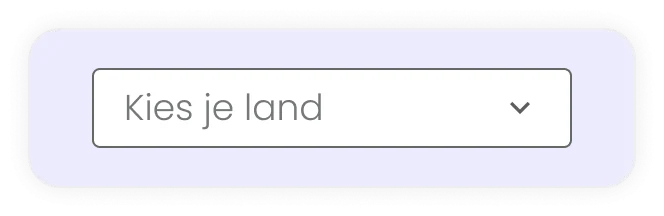
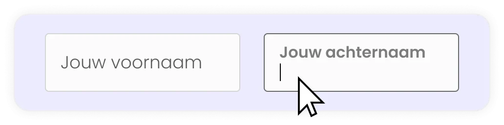
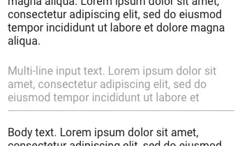
The most common way of labelling today, anno 2023, is labels above input fields and floating labels. Besides these two forms, you can also align labels left or right in front of input fields or inline.
In this guide, I distinguish between inline labels and floating labels. Floating labels start as inline labels, but they move above the text when the user activates the field. Inline labels are labels where the label disappears when the user activates the field and starts typing.
Around 2010, the discussion about labels was mainly about the alignment of labels left before, right before or above input fields. Now most discussions are about labels above input fields versus floating labels.
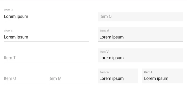
So are left-aligned and right-aligned labels for the input field obsolete? No, we just don't use them as often anymore. Left-aligned labels are now seen in your tax return on desktop, for example:
But which placement is best? Above, inline, floating, left or right? Let's look at the pros and cons of each label placement, and in which context it's best to use labels for your form.
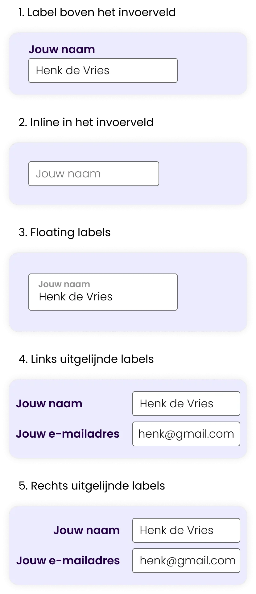
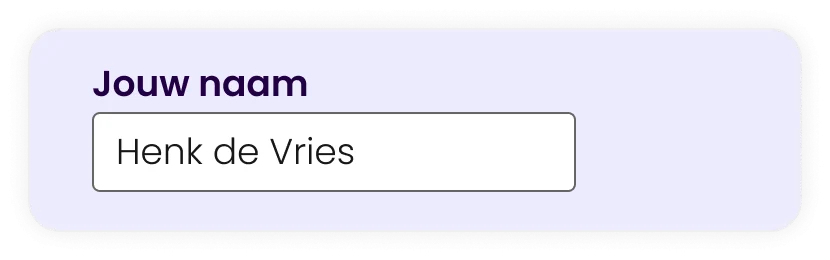
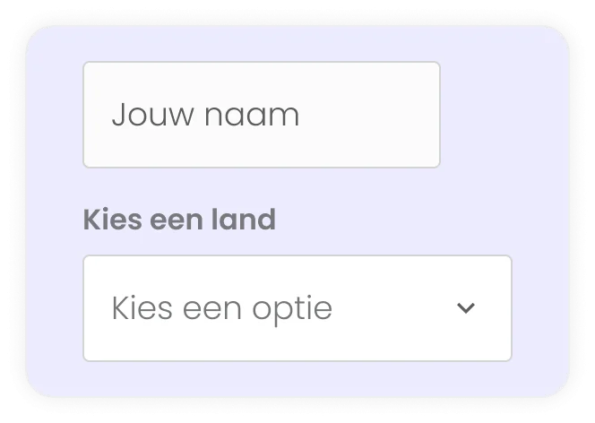
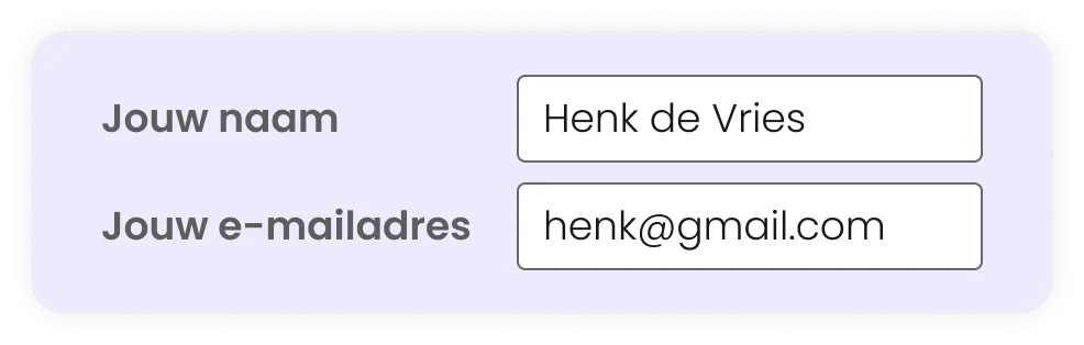
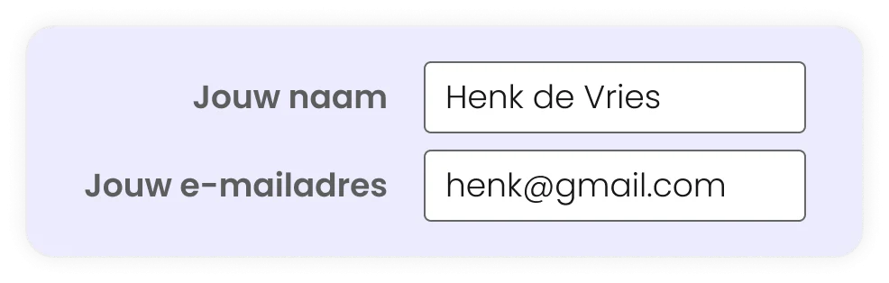
1. Label above the input field
The first candidate is the label above the input field.
The fastest way to scan a form
The most cited research on label placement was done by Matteo Penzo in 2006. Based on a eyetrack study with different tests of label placement, he came to the following conclusion:
Placing a label above an input field works better in most cases, because users aren’t forced to look separately at the label and the input field.

Matteo Penzo, 2006
UX expert
In other words, by placing the label above the input field, users see the label and the input field at once. They do not need to move their eyes to see the label and the input field.
Of the four different studies, users completed the form fastest and with the least cognitive load if the label was above the input field.
The placements studied were*:
Labels above the input field
Thick labels above the input field
Left-aligned for the input field
Right-aligned for the input field
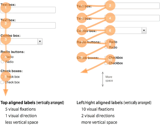
In 50ms, users moved their eyes from the label above to the input field. Which was 10x faster than left-aligned labels.
It takes the user less cognitive effort to perceive the two elements, label and input field, because they are closer together than a label for the input field.
Also, the user only needs to move their eyes in one direction: down (Luke Wroblewski, 2008, pg.59). Which provides a clear path to completing the form.
* This research was done before floating labels existed. It may be interesting to repeat a similar study looking at labels above the input field versus floating labels.
Extra space for explanations and translations
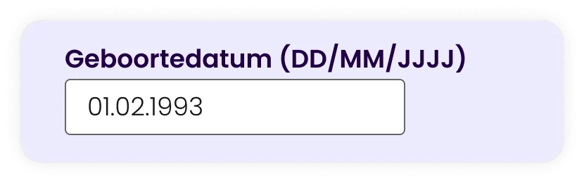
Compared to other label placements, labels above input fields are not limited to 1-2 words. As research institute Baymard rightly points out, there is more room to clearly describe labels, and you can, for example, add instructions in or below the label. Think 'DD/MM/YYYY' after the question 'Date of birth'.
For multilingual forms, the label above input fields is the most favourable solution. Because then you have enough space to translate texts into longer sentences that require more space.
Disadvantages of labels over input fields
A label above the input field has a major drawback: many questions require a user to scroll longer to complete the form. This is due to the white space you need between each question.
You can solve this by splitting a form into sections on multiple pages. So that after completing a section of questions, you move on to a new page or section. Dividing into steps makes a long form manageable for the user
The blog UX Movement argues that you need extra white space to group labels and fields. This way, you make the form extra long, and create unnecessary interruptions in the user's scan flow.
However, there is no research or evidence for this. So it remains to be seen whether this actually bothers users.
Furthermore, there is no evidence that scrolling in a form has a negative effect on the user experience. Especially if it is clear to the user that he or she is achieving their goal (completing the form) by completing the form in full.
Quickmark also claims in a blog that having labels above input fields gives more elements for your eyes to scan, thus increasing the number of visual fixations . But in this article, there is no factual evidence for the assumptions.
TL;DR: Labels above the input field summarised
Advantages
It provides users with the fastest way to scan and fill in a form.
Users only need to move their eyes in one direction, which is less cognitively demanding than left and right aligned labels.
You have more space for text and additional text so you can describe input fields properly.
Cons
You have more elements and therefore also take up more white space, making forms longer and requiring users to scroll further.
2. Inline Labels / Labels als placeholders
I'll come straight to the point, inline labels or labels as placeholders are a no-go in the UX world!
Yet I see designers still using these labels:
Inline labels save screen space, but come at the expense of the overall user experience. Because if the hint or label disappears as soon as you click on the field, it is easy to forget what the question was.
There are always exceptions to the rule. For example, in forms where you only ask for an email address, the chances of the user forgetting the question are very small. Or consider a search field where you have a field that contains a search icon.
Why are inline labels a no-go?
Tricky context to ascertain and may cause doubts
Confusion with completed fields
Confusing error messages
Not suitable for drop-downs
Tricky to figure out context
The biggest problem is that the label disappears as soon as you start typing or activate the field. The only context you had for filling in the field is gone. Luke Wroblewski emphasises that this makes it unclear to users what to fill in (Web Form Design 2009, pg. 100).
Users have to struggle to remember labels while typing. This can lead to extra cognitive load and frustration, which interferes with the user experience.
Confusion with completed fields
Inline labels can give users the idea that the field is already filled in. As a result, there is a chance that the user will skip the input field, and get an error message.
Confusing error messages
Since the user has no context after filling in fields, he or she is dependent on well-formulated error messages to adjust their input.
If error messages are not set up properly and show a default message such as: "This field is filled in incorrectly", the user does not know why it is filled in incorrectly.

For example, Baymard Institute showed in one of their studies on mobile forms that several users became frustrated by a cryptic error message they could not place without context.
From the error message, users could not figure out what they had done wrong, and had to delete their input.
Not suitable for drop-downs or other selection boxes
For input field types other than text fields, inline labels are also less suitable. With drop-down options, inline labels turn into a label above the box. Which makes the design of your form inconsistent.
Further, users may think, for example, that the drop-down is already filled in. In Baymard's study of mobile forms above, they saw that users got confused.
Just don’t do it
Although inline labels seem space-saving, the disadvantages outweigh the advantages. They create more ambiguity than clarity, which is exactly what you want to avoid when your form is the main means of interaction with your customers.
Therefore: do not use inline labels, unless you have only one or two input fields, such as a login form or search field.
3. Floating labels
Let's move on to candidate number three. A strong candidate, there is no doubt about that according to the huge fan base.
Indeed, for a few years now, Google has adopted this style for all its forms in Material Design. But what are Floating Labels?
Floating Labels, or Infield top aligned labels, are labels that start as a kind of 'placeholder' in the input field to 'save space'. On activating the input field, the label moves upwards with a short animation. Nielsen Norman Group (NNGroup) calls the floating label an 'Adaptive placeholder'.
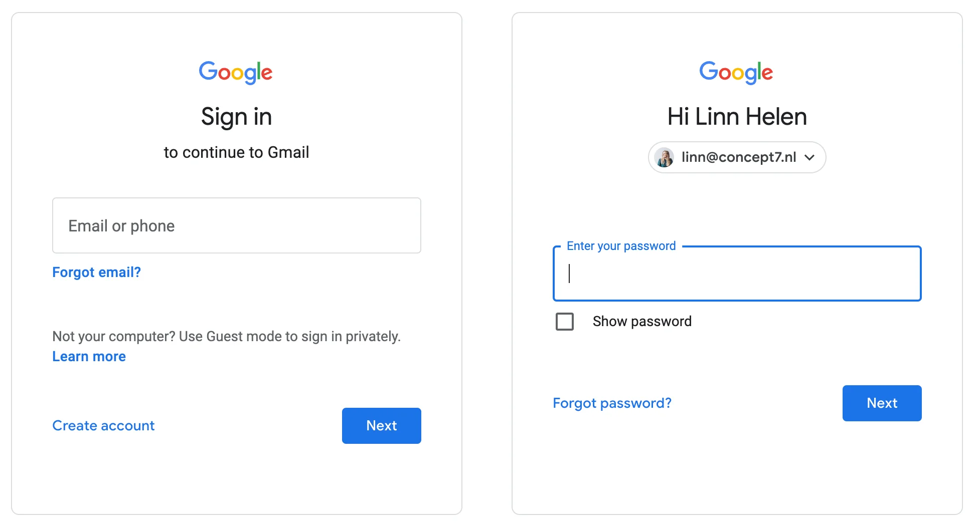
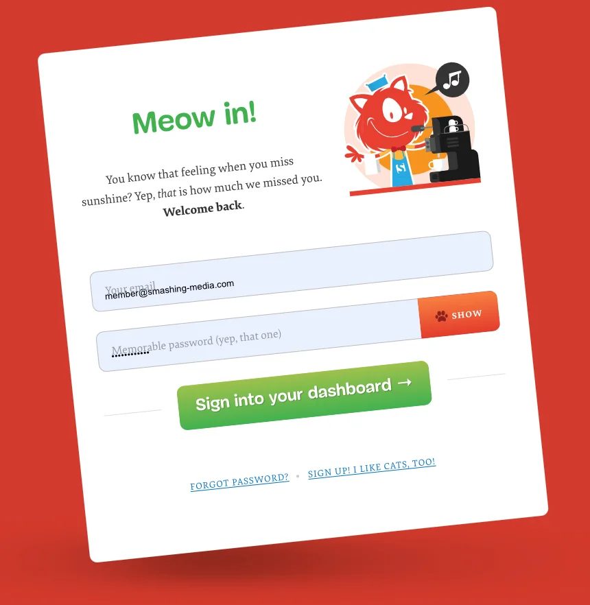
You probably recognise them from your Google Inlog.
Floating labels are sexy, but are they any good?
In 2013 when floating labels were new, they were seen as the solution to all the problems posed by inline labels. Whereas with inline labels, a user no longer has a reminder after activating the input field, with a floating label, the label remains visible.
Furthermore, floating labels make for a clear and scannable design. In 2013, fans even went so far as to call this new design sexy. Perhaps we can discuss for a moment to what extent a form can be sexy 👀.
Saving space with floating labels
Floating labels save space as less vertical space is needed for the label.
And as UX Movement claims, the user has less elements to look at. This is because the label is often inside the input field, making users perceive these elements as one. This allows users to better focus on the input fields. However, no studies have been done to prove this.
How do you design a floating label?
As of 2017, Google Material Design works with floating labels in their input fields by default. Google conducted multiple user surveys to arrive at the ultimate design of floating labels.
In Google Material Design's original design, it was not clear to users that they could click on it:
By the line, it was not recognised as an input field.
It looked like an empty field.
It did not invite interaction.
On a side note, Google only compared different floating label designs in their user surveys. They did not look at a label above the input field versus a floating label. Therefore, we cannot say anything about the effect of floating labels.
The aim of the surveys was to provide users with a form that they could fill in flawlessly and quickly.
For each variation, Google looked at the following factors:
Recognisability - the number of clicks on the right input fields versus the wrong ones
Scannability - the time it took a participant to find the requested element
Preference - the personal preference of each participant
Furthermore, Google looked at various design elements:
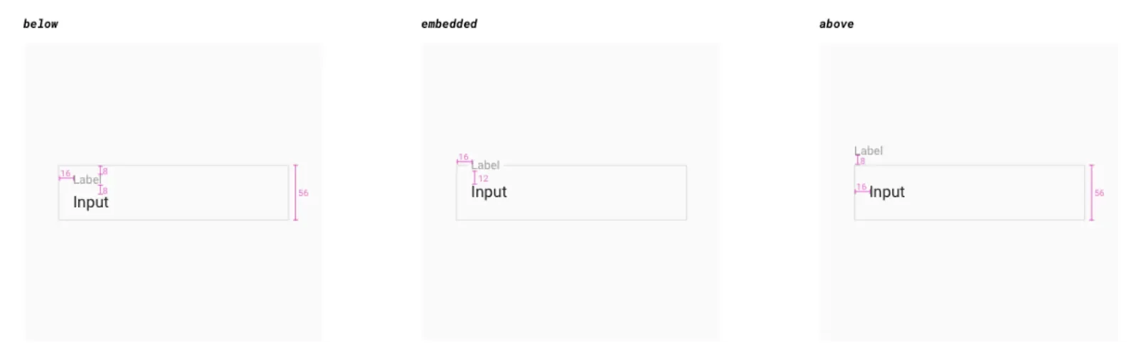
The style of the box for the input field
Label placement*
The Contrast
Edge style.
*Label placement is about where the label moves after the field is activated.
Key findings from the survey:
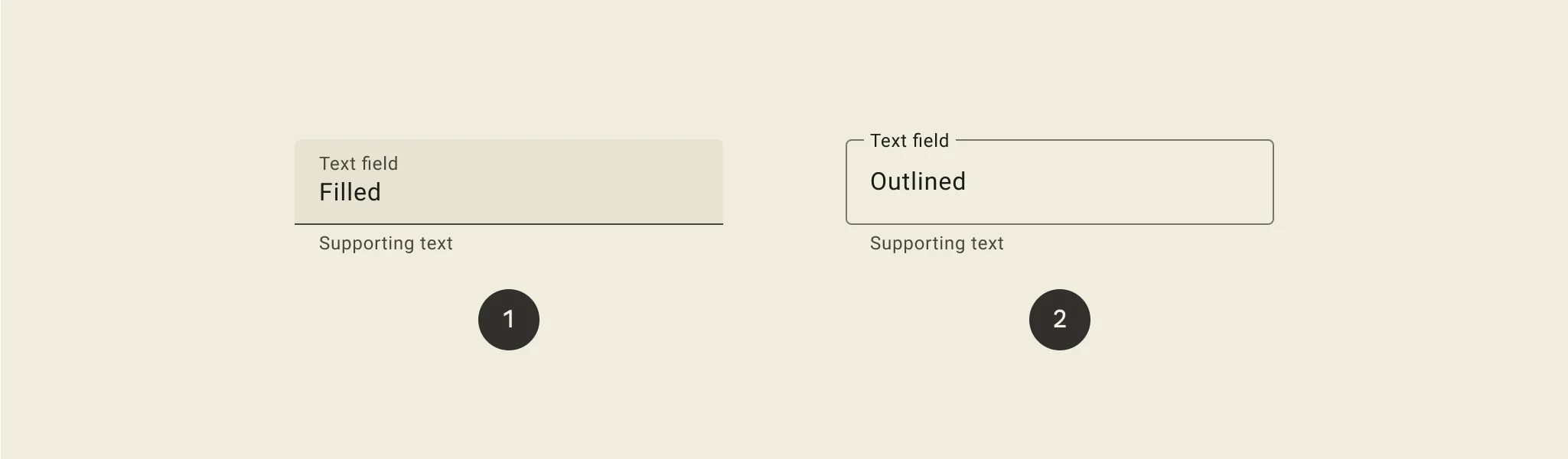
Enclosed input fields with a 'box' shape works better than just a line
Input field with a semi-transparent fill and a line or a transparent input field with a thick line works best
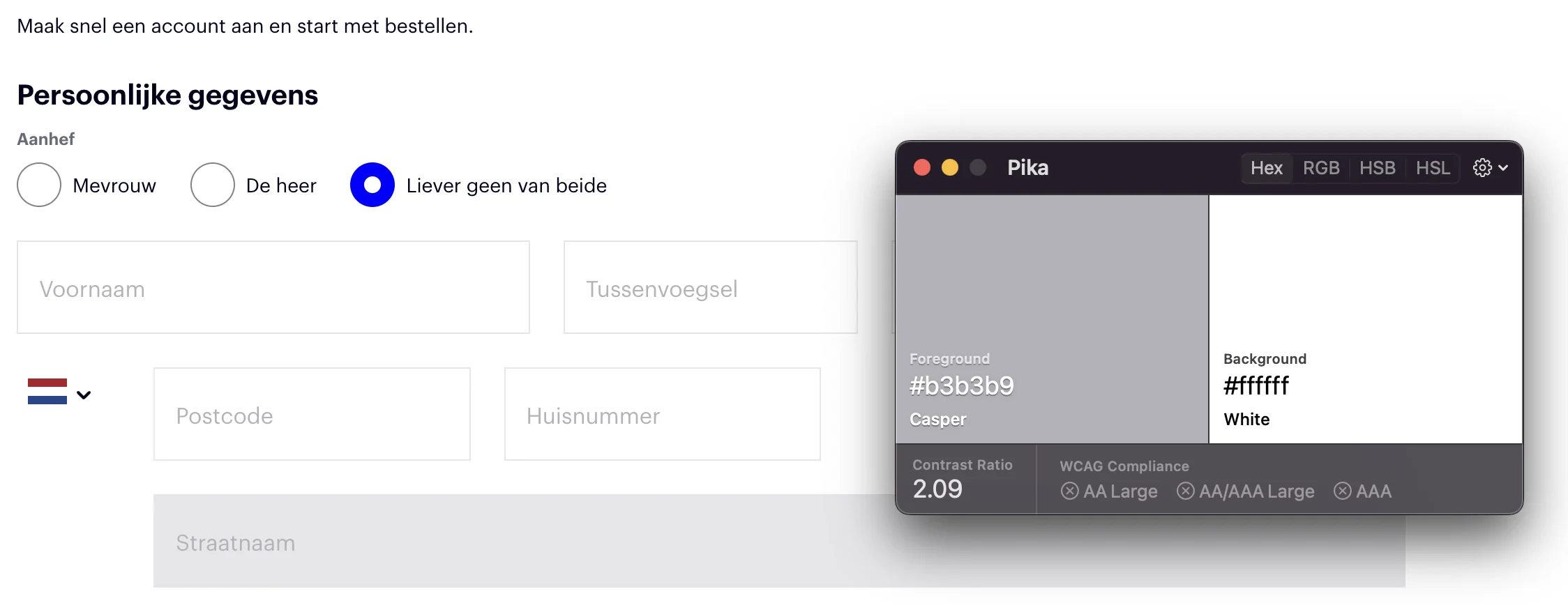
Elements of input fields should have a minimum contrast ratio of 3:1 with the background*
Label text within the input field
Input fields with rounded corners
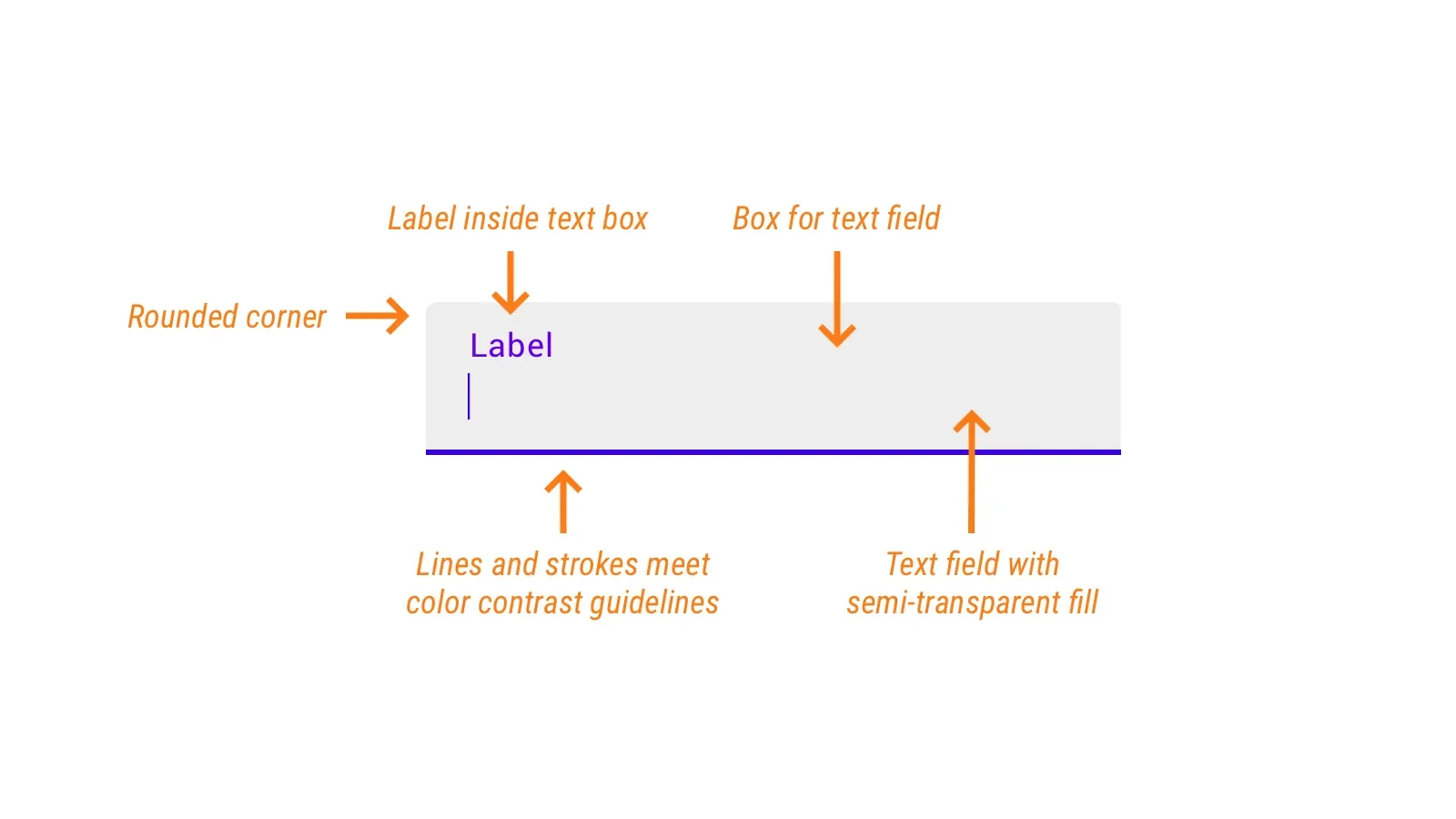
*According to WCAG guidelines, elements should have a contrast value of at least 4.5:1 to be easily readable.
For a comprehensive design guide to floating labels, check out Google Material Design. They explain how to deploy floating labels, everything from design tips to where to place hints and display error messages.
They also explain how to design floating labels that comply with the WCAG accessibility guidelines.
Criticism of Floating Labels: Is there a better option?
Still, there is some criticism of the floating labels. It's not all roses.
According to Jessica Enders in the book Designing UX Forms (2016) and interaction designer Adam Silver, floating labels still have too many problems. Both designers recommend avoiding floating labels.
The problems are as follows:
Forms are not a source of entertainment. The floating label won’t make users enjoy using forms. Users don’t care. They just want the outcome.

Adam Silver
Interaction designer
1. Confusion with completed fields
One of the main criticisms is that an input field with placeholder text does not stand out as an interactive field. This may give the user the idea that the input field is already filled in. Which can lead to skipping the field or leaving the placeholder. Thus, he gets unnecessary error messages because he did not fill in the field (correctly).
2. They are difficult to read
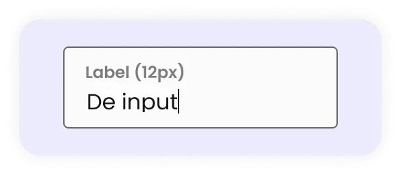
Floating labels are difficult to read because the font size is often too small. This can lead to errors and frustration when filling in the form.
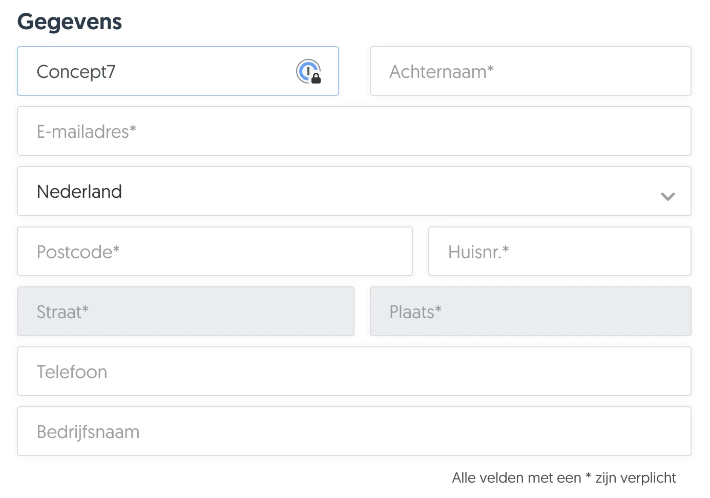
Google itself uses font size 12px for their floating labels when active. If you want to make something scannable, it is advisable to use larger font sizes. In designs by Concept7, we use a minimum of 18px as a standard for text.
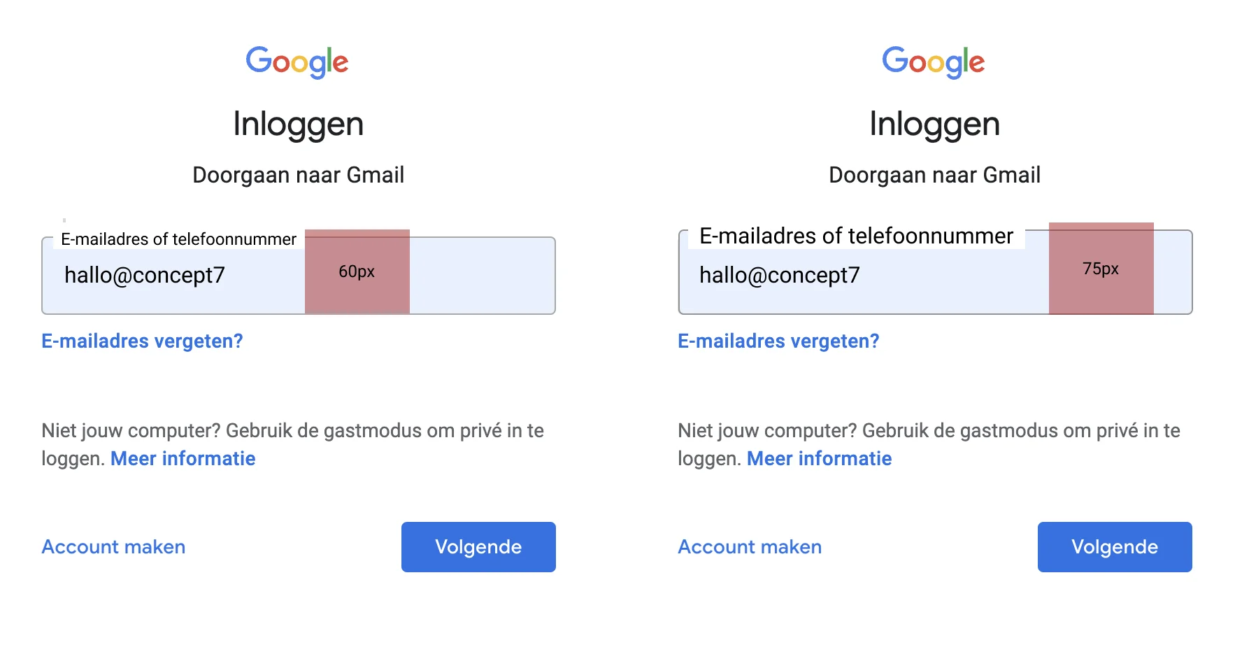
3. You save less space than you think
The labels need space to move up when the user starts typing. This ensures that extra white space is needed around the input field. If this is not implemented properly, the page will jump when the field is activated.
Space saving in input fields depends on font size. If you want the labels to be readable, there should also be more white space in the input field. As an example, I have used Gmail's login form:
4. Animation problem
Floating labels need animation to change position. This can affect page size and load time. Also, sometimes animations may not work well on all devices or in all browsers.
5. Limited contrast and readability
Because floating labels start as placeholders, they often have a light grey colour that is not noticeable. If the grey colour does not meet the minimum WCAG contrast values, it is difficult for users to read the text at all.
6. No long labels possible
Floating labels are limited to the length of the input field, and ideally you should also have some white space before and after the label. This makes it impossible to use longer queries as labels. This truncates your label.

7. Inconsistent input fields
Floating labels are made for input fields where you enter text.
Other fields such as checkboxes, radio buttons and drop-downs do not fit into the framework of floating labels because there is no placeholder text. This creates an inconsistent design with a mix of labels above the field and floating labels.
8. Less space for hints
A key USP for floating labels is that they can save space. This limits space for hints or directions. And users may miss important context or instructions.
According to the World Wide Web Consortium (W3C), an organisation that designs the web standards for the worldwide web, it is good for accessibility to put hints in the label, such as:
Also, floating labels does not follow the standard that you should not use placeholders and hints as labels.
9. Autofill
One of the problems users often encounter is that autofill and floating labels sometimes do not go well together. The autofilled text comes on top of the placeholder because the input field is not activated correctly.
10. Not accessible
There are also some critical accessibility issues to consider. According to the World Wide Web Consortium (W3C), assistive technologies such as screen readers do not see text in an input field (placeholders) as labels.
Also, placeholder text is not widely supported by assistive technology and by some browsers.
Are floating labels really that bad?
The creator and designer of floating labels, Matt D Smith (MDS) disagrees with the criticism:
Hints can easily be added below the input field, this does mean more white space is needed.
Small text size has to do with the designer, not floating labels. Making floating labels the same size as a standard label is not a problem.
MDS does agree that floating labels save little white space.
Low contrast has little to do with floating labels, but everything to do with size and colour.
Shortened labels is not the problem, according to MDS, the problem is why you need a long label. If you really need to ask a long question, and it's not a bad question, he suggests you don't use floating labels but another type.
Conclusion: Floating labels or don't?
Whatever floats your boat!
There are currently no in-depth usability tests available on the performance or workings of floating labels. The benefits named by Google are mainly aesthetic and not functional.
Seems like a lot of effort when you could simply put labels above inputs & get all the benefits/none of the issues.

Luke Wroblewski
UX expert
But, who says floating labels wouldn't work for your form?
The creator of Floating Labels, MDS stands behind his design and says there must be a good reason why Google is using this as its default design.
A user who is entertained is much more likely to remember their experience with your product.

MDS
Designer
I would say go for it. The important thing is to test what works and what doesn't, with user research or an A/B test, for example. Only then can you draw firm conclusions. Ultimately, it is also a matter of which type of form generates the most conversions.
4. Label left-aligned before your input field
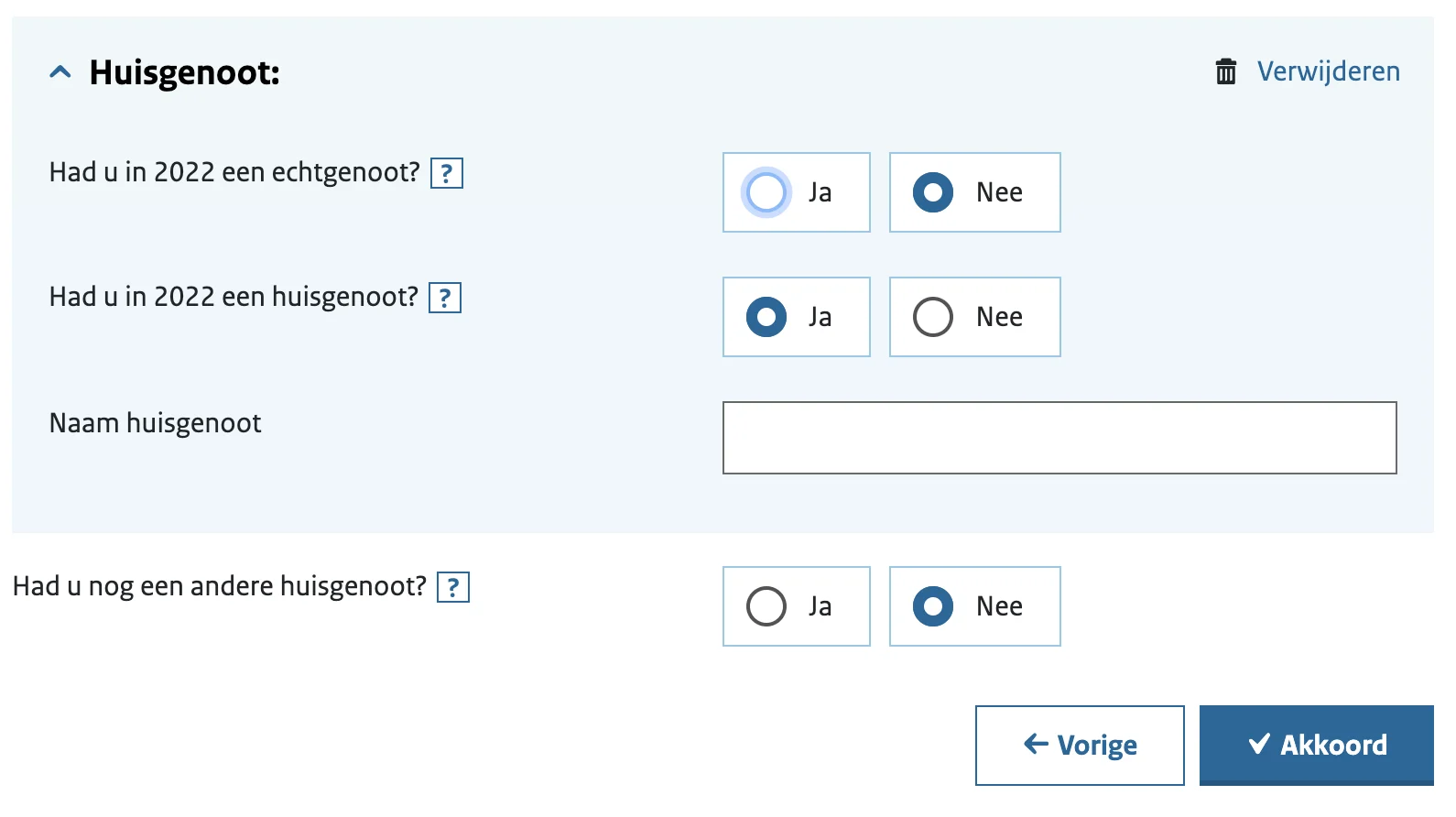
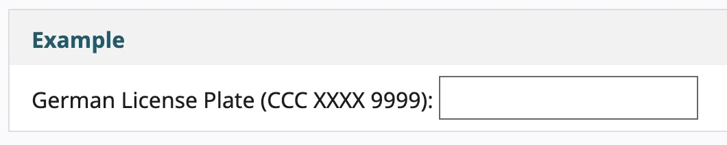
Some 15+ years ago, left-aligned labels were more common. Now you hardly see them anymore. Except when you want to fill in your tax return.
Does this mean that left-aligned labels are bad and don't work properly?
The short answer is no!
Left-aligned labels have their advantages, and can work well in some situations. After all, these labels provide:
Clearance
Less vertical space
Efficient scanning of labels
.
However, left-aligned labels are not always practical. UX designer Jessica Enders' rule of thumb is: for large screens, left-aligned labels are fine, but on mobile, the labels belong above the input fields.
When the screen is larger, labels should go to the left of fields; when the screen is smaller, labels should go above fields.

Jessica Enders
UX expert
Left-aligned labels are clear
With left-aligned labels, it is clear to users which input field belongs to which label. The time it takes your brain to register it does take longer than with labels above input fields. 500ms compared to 50ms.
The white space between the label and the input field directs users to the input field. U from Matteo Penzo's research, it is clear that people are not distracted by the white space.
To reinforce the visual connection between labels and questions, you can give sections colours to emphasise the relationship between labels and fields. Jessica Enders calls this "zebra striping".
Less vertical space with left-aligned labels
Left-aligned labels take up less vertical space compared to labels above the input field or floating labels. This means forms are more compact and take up less vertical screen space.
Note, this is only applicable on desktop, because in the mobile version of your form, it is better to place the labels above the input fields.
Scannable forms
For unfamiliar forms or for non-standard questions, left-aligned labels help users scan through the form calmly (Luke Wroblewski, Web Form Design 2008). This makes it easier for them to understand what you are asking and when before filling in the form. It may take them more time, but users have no trouble filling in the form because of this alignment.
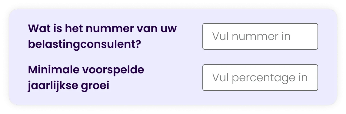
Because of this, it is actually not that surprising that questions in the Inland Revenue form are aligned to the left. While it is a form you fill in every year, they are not questions you encounter every day. Unless you might be a tax consultant. 🙃
Draft considerations
We have been using left-aligned labels less in recent years for a reason. With the introduction of smartphones and responsive design, it was quickly apparent that left-aligned labels were not applicable on small screens.
Disadvantages at a glance:
Limited space for long labels
Longer fill-in time
Not suitable for mobile
Limited space for long labels
Left-aligned labels are not intended for long questions. When questions are too long, the white space between the label & input field is small. This makes it more difficult for users to scan the labels.
Questions that are too long are divided into two lines if the question is too long. This makes the label more difficult to scan.
Longer fill-in time
UX researcher Matteo Penzo found that users in his study experienced high cognitive load when filling in forms with left-aligned labels.
It also takes longer for users to complete the form compared to forms with labels above input fields.
Luke Wroblewski (2008) also indicates that people take longer to fill in the forms because there are more items to process in front of your eyes.
In essence, users have no trouble understanding labels, it just takes more time. And that is not necessarily a negative. Sometimes you want users to take just a little more time to fill in the form. Just like with your tax return.
So there are twice as many visual brackets for users to handle.
Left-aligned labels are not suitable for mobile
On smaller screens, there is insufficient space to place the label to the left next to the input field. Placing the label next to it anyway can lead to a negative user experience. Input fields are too small for the input and are not easily visible. This increases the likelihood of errors.
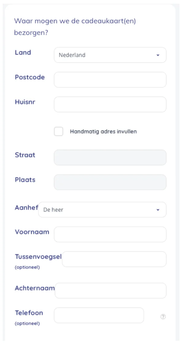
Or are the input fields no longer neatly lined up, but instead staggered, as in the example below.
Baymard's research found that users even struggled to fix these errors because they could not see their inputs properly.
Are left-aligned labels still applicable?
Yes, they are still relevant. As long as you use them in the right context. Do you have a complex form where you don't ask standard questions? Then it might be interesting to work with these labels.
According to UX expert Janet M. Six, there are 2 questions to ask when choosing left-aligned or right-aligned labels:
Want users to quickly scan the labels in your form first? Then use left-aligned labels.
Do you want users to easily understand which label belongs to which input field? Then use right-aligned labels. (See section below on right-aligned labels)
Ultimately, it's a matter of testing and experimenting and figuring out what works for your form.
5. Right-aligned label for your input field
If I have to say goodbye to any of the different placement of labels, I like to wave goodbye to right-aligned labels. Not because they are very bad, but because you already have some better options.
Labels right in front of your input field have many of the same advantages and disadvantages as left-aligned labels. However, they are easier for users to process than left-aligned labels. Between 170ms and 240ms compared to 500ms for left-aligned labels. And provide less cognitive load.
According to Luke Wroblewski, the advantage of this placement is that the labels are close to the input fields. However, we in Western countries read from left to right, and prefer texts that are left-aligned (Web Form Design 2008, pg 94).
Also, this placement of labels has little flexibility in terms of length because you have no space between the label and the input field. If your question is over two lines of text, the label is harder to scan.
Did you know that there used to be an ISO standard for the 'correct design of forms'? In this 1998 standard, ISO 9241-17:1998, you had to align labels right. But if the labels are the same length, you can align them to the left.
So what is the correct placement of labels in forms?
The placement of labels directly affects the user experience and therefore indirectly affects your conversion. Labels tell users what information to fill in. Currently, there is no universal way to place labels.
The choice depends on your context and the purpose of the form. Are the questions short or long? Are they complex? Is there a lot of room to scroll? Or do most visitors come via mobile?
The 5 labels summarised
Thus, we saw that labels above input fields and floating labels are quick and effective, while left-aligned labels are especially useful for complex forms.
Labels above input fields seem to be the fastest and most effective way for users to scan and fill in a form. However, they make for longer forms.
Floating labels are aesthetically pleasing but can cause problems. Such as limited readability and can cause confusion because the field is already 'filled'.
Left-aligned labels are less likely to be used. They are clear to users and take up less vertical space. Especially for complex queries, this placement is ideal. However, this placement is not suitable for mobile.
Right-aligned labels do not require much mental effort for users, but are not the norm according to our reading conventions in the West. Also, there is no room for long questions or explanations.
Inline labels, or labels as placeholders in an input field I do not recommend. It is difficult for users to understand context and can lead to confusion and errors.
Only by testing your form will you find out which placement works best for your users.
At Concept7, we use standard labels above input fields for the best user experience. And we split long forms into sections/pages to reduce cognitive load. As a follow-up to this article, I want to conduct experiments with Floating Labels versus labels above input fields.