
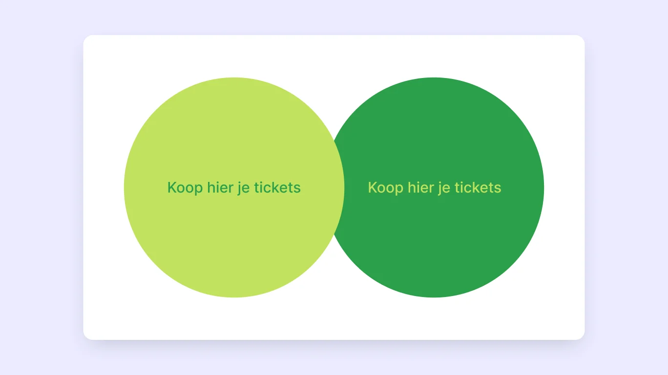
The other day, I wanted to buy tickets online for a theatre festival. That didn't go as planned.
Firstly, I couldn't even find the ticket page. Secondly, the website was so cluttered that I did not know which tickets to buy for which show.
In the end, I was not successful. All the performances were sold out... How then? I wonder that too. 🤔 It frustrated me as a designer and conversion optimisation generalist that I didn't succeed.
Maybe I was a lazy website visitor, maybe my motivation was already low, and maybe there were too many barriers. The website's colour scheme didn't help either. Green text on a puke green background.
Where do I want to go with this story? Accessibility. In particular, poor accessibility. In this article, I look at how to design accessible forms.
Because a poorly designed form keeps your visitors from converting on your website. By designing accessible forms, you don't just improve the user experience for people with disabilities. You improve the user experience for everyone.
So, how can you design effective forms that are also accessible?
5 Key learnings for accessible forms
In this article, you will learn how to design an accessible form. I give you 13 practical tips that you can put to use immediately to make your form accessible to all users on your website.
Want to know if this article is of interest to you? These are the top 5 learnings you can put to use immediately:
Indicate in the H1 or H2 that an error occurred or that the form was submitted successfully
Provide general instructions before the form so that assistive technology can read the instructions
What are accessible forms and why are they needed?
It may not surprise you (or maybe it does): most online forms you come across are not optimised for people with visual, hearing, motor or cognitive impairments. In the Netherlands alone, 4.5 million people have some form of disability or chronic illness.
From research by Baymard Institute in 2021, we see that 94% of the largest e-commerce sites do not meet accessibility requirements (WCAG 2.1 AA).
We still have a long way to go. So does Concept7. We are very honest about that. There is always room for improvement.
Do you want to know more about accessibility and websites? Earlier, we wrote an extensive article on the Web Content Accessibility Guidelines (WCAG) and accessibility for websites.
Accessible to all, but how?
In the book Accessibility for Everyone, Laura Kalbag (2017) gives us four guidelines to improve the user experience for everyone:
Visual: make it easy to see
Auditive: make it easy to hear
Motor: make it easy to interact
Cognitive: make it easy to understand
“Sighted users can read them, visually-impaired users can hear them by using a screen reader, and motor-impaired users can more easily set focus to the field thanks to the larger hit area.” - Adam Silver, Form Design Patterns
Accessible forms are a collaboration between technology, design and text. It's not enough to just design a functionally beautiful form if the technology doesn't work!
With the right technology, you guide users through the form in the way that works for them. For example, by giving the right keyboard instructions or assistive technology.
The need is high. In this article, we take you through how to design forms that comply with WCAG guidelines. And how to improve the overall user experience.
These insights were drafted based on the guidelines of the World Wide Web Consortium (W3C) and wcag.co.uk.
Accessible Labels
In a previous article, we looked in detail at user-friendly labels and the placement of labels in forms. Now we zoom in on what makes labels accessible.
Tip 1: Clear <label> element
First of all, all input fields should have a label that is clearly identifiable in the code with the <label> element. And these labels should also clearly communicate the purpose or question of the input field. This also applies to buttons.
For input fields such as a search bar, however, it is allowed to visually hide the label. This means that it is clear in the code that there is a label. But this is not displayed visually.
Tip 2: Increase the clickable area
When a user clicks a label, the input field is also activated. The larger the 'click area', the easier it is for someone with a motor disability, for example, to click the input field or label (Adam Silver, Form Design Patterns, 2018, pg. 21).
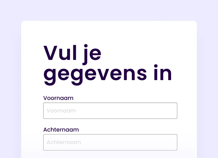
This is a good argument for using labels above input fields instead of other placements in forms. Because a label above the input field, including instruction directly below the label, increases the 'click area' compared to floating labels or left/right aligned labels.
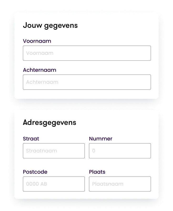
Tip 3: Group related input fields
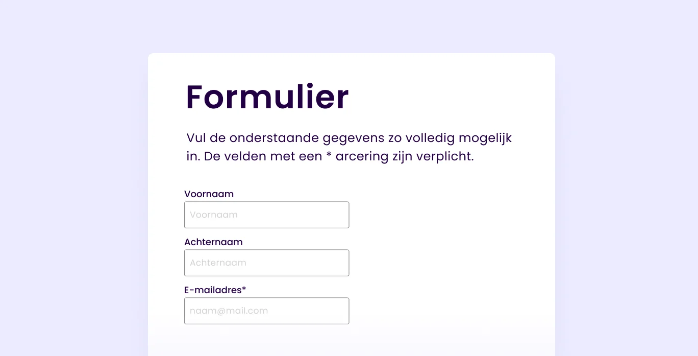
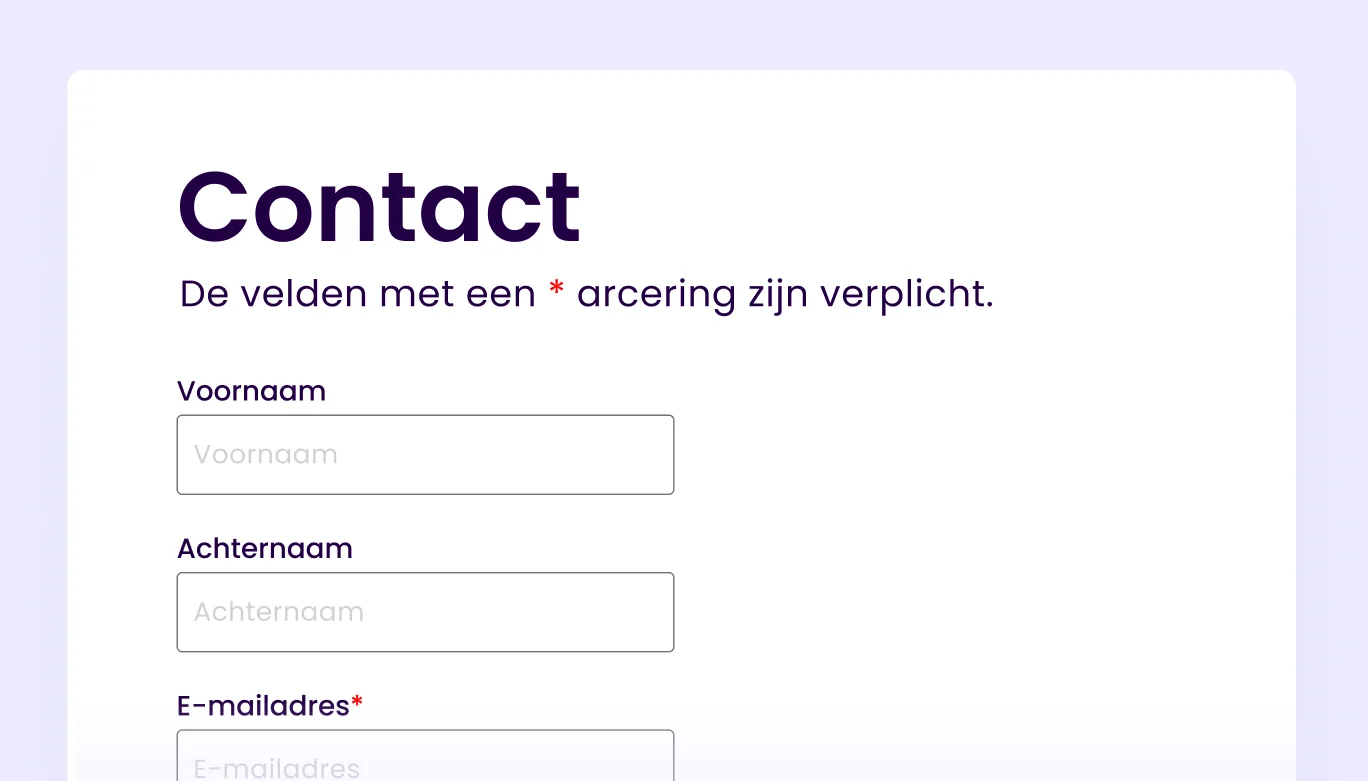
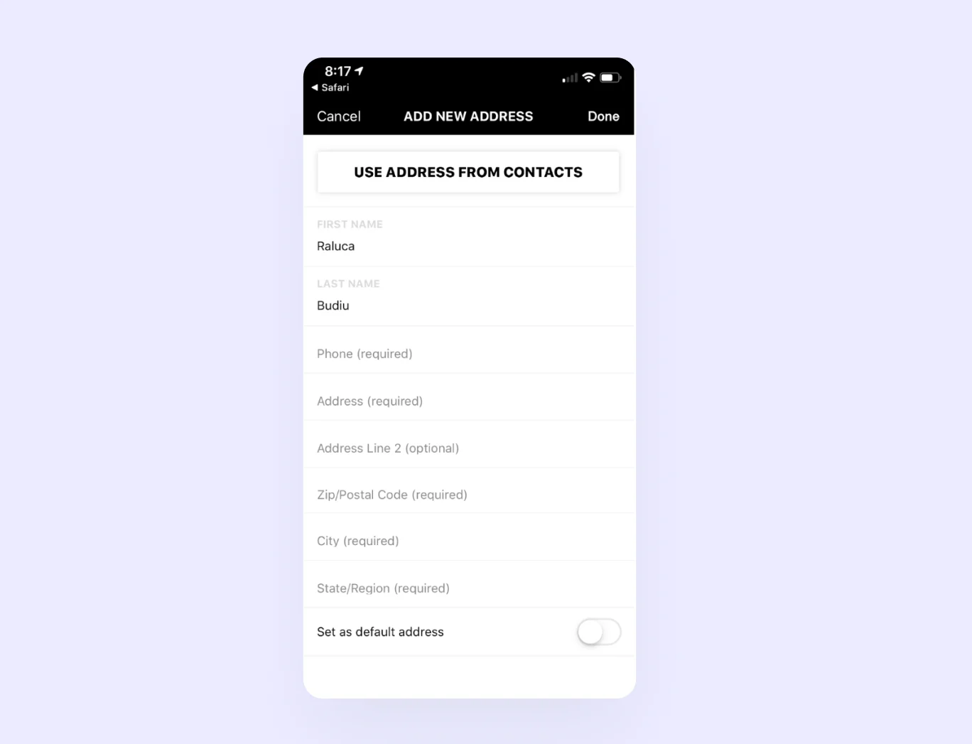
Does your form consist of several sections and several input fields? Then it is good to group the input fields that are related to each other. For example, think of personal data and address details. This ensures that the user knows what to expect, and the context is clear to the user
Instructions, explanations and placeholders
Sometimes your form needs instructions or explanations so that the user can fill it out with ease. Therefore, show instructions that are relevant to the entire form at the top. Think about indicating how to recognise mandatory or optional fields.
Offering this information before the form allows assistive technology to better read the text before it switches to 'form mode'.
There are three ways to give instructions specifically by input field:
In the label as part of the question
Below the label or below the input field
Inside the input field
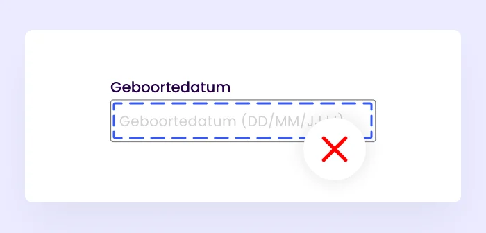
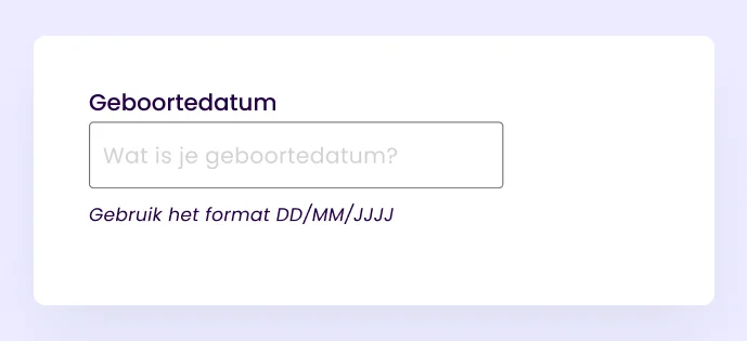
Tip 4: Give instructions in the label
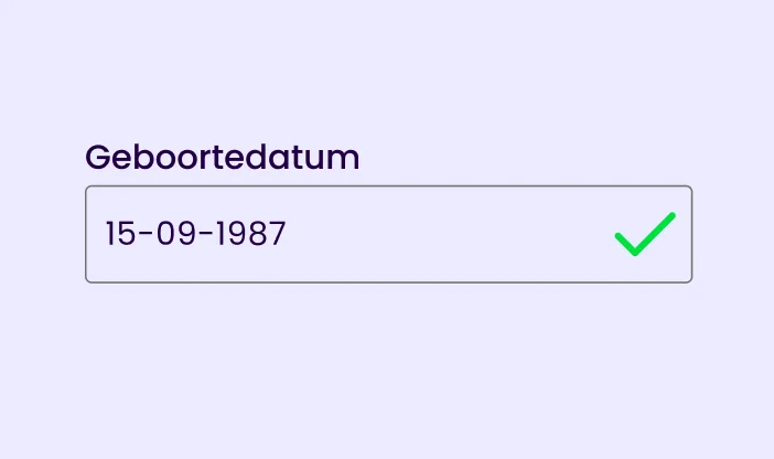
The easiest way to give instructions is through the label itself. You can do this by asking clear questions that are not long and complicated. You can also specify, for example, the format of what someone has to fill in.
Example: Date of birth (DD/MM/YYYYY)

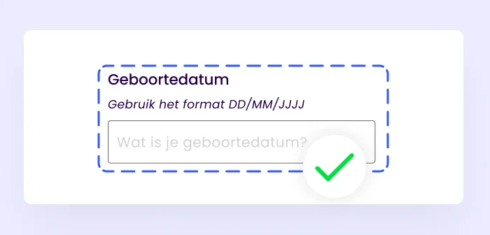
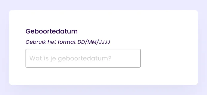
Tip 5: Instructions beyond the label
Sometimes there is not enough space to provide a complete explanation in the label. Then you can show the explanation below the label or below the input field. To make these instructions accessible, they must be declared as ARIA labels in the code. Otherwise, they will not be properly recognised as instructions by assistive technology.
One possibility would be to place the instructions directly below the label but above the input field so that it is read first by the assistive technology. This also helps with increasing the click area.
Tip 6: Instructions as placeholders must be readable
Placeholder text in the input field that suggests to the user what she should enter. This text often has lower colour contrast than the labels or text typed by the user. And the placeholder text disappears from the input field when a user activates the field.
If the placeholder text contains an important instruction, it is harder for users to check the form before submitting it. Often, assistive technologies cannot read placeholders properly, and older browsers don't even show them. The placeholder is NOT a substitute for labels.
Furthermore, placeholder text often has a colour contrast that does not comply with WCAG guidelines. This makes them difficult to read. The World Wide Web Consortium (W3C) recommends using the following colour code for placeholder text: #767676 if the background colour is white.
Tip 7: Clearly indicate mandatory fields
For many people, an asterisk in a label or after an input field is synonymous with a required field. But not for everyone. There will always be people who don't know or don't understand this. This is why it is important to include how a user can recognise mandatory fields in the instructions above the form.
Mandatory fields can be marked with an 'asterisk (*)' or written out in brackets '(mandatory)'. Furthermore, NNGroup says it can also be smart to mark both mandatory and optional fields.
However, this can create more cognitive load as more textual brackets are present. The UX Collective therefore advocates that in forms you can better indicate which fields are optional by marking them with '(optional)'. This does require the form to have a clear introduction with instructions. For example: 'All fields are mandatory except if marked with 'Optional'.
In a study, UX expert Luke Wroblewski sees that the word 'Optional' performed better than a visual indication such as an asterisk *. Users perceived the form more positively than when mandatory fields were only indicated with an asterisk.
If there are many mandatory fields, it can be difficult for the user to recognise the optional ones. Therefore, UX expert Jessica Enders advocates highlighting only the optional fields and not using an asterisk (Designing UX Forms, 2016, p. 171).
Which is the correct answer? Indicate mandatory fields or the optional ones?
From the eyetrack study by Seckler, Heinz, Bargas-Avila et al (2014), it is clear that it is necessary to distinguish between mandatory and optional fields anyway.
Ultimately, it's about making it clear and easy for the user. Therefore, be consistent in the form, choose one way to indicate mandatory fields or optional fields and indicate in the introduction how the user should fill in the form.
Colour and contrast for mandatory fields
Should an asterisk be red? It is not necessary but is common. It is important that not colour alone indicates that something is important or mandatory. By only indicating something with colour, colour-blind people may miss the hint completely.
Notifications and error messages
Make sure notifications and error messages are easy to understand. Give visitors clear and simple instructions when something needs to be resolved. If a form is submitted successfully, the user should get feedback that it was successful.
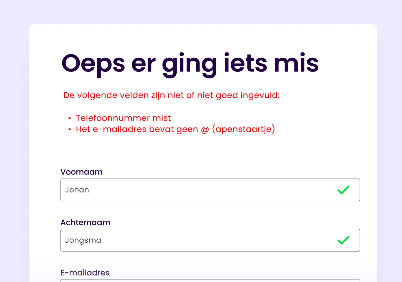
Tip 8: Use the headings to display errors or successes
Error or success messages are best communicated through page headings. Why so you may ask? When the page reloads after submitting the form, the help technology starts again at the very top of the page. This allows the user to get an immediate notification that the form submission was unsuccessful. Display errors or successes in the H1 or H2, for example:
<H1> 3 errors - contact form </H1>
<H1> Thanks! Your order is being processed immediately </H1>

Tip 9: Place a summary of the error messages above the form
Make it easier for users by showing a summary of error messages before the form starts.
Give the summary a clear title
Reference to the label where the error occurred
Provide a clear description of what went wrong
Explain how the user can resolve the error, including any format requirements
Link to the relevant input field so the user can resolve it directly
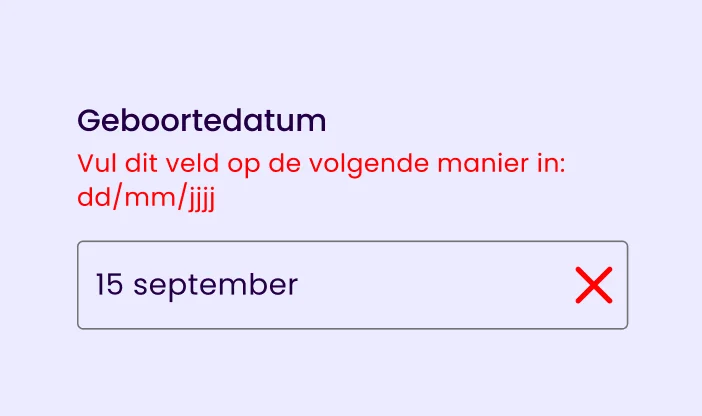
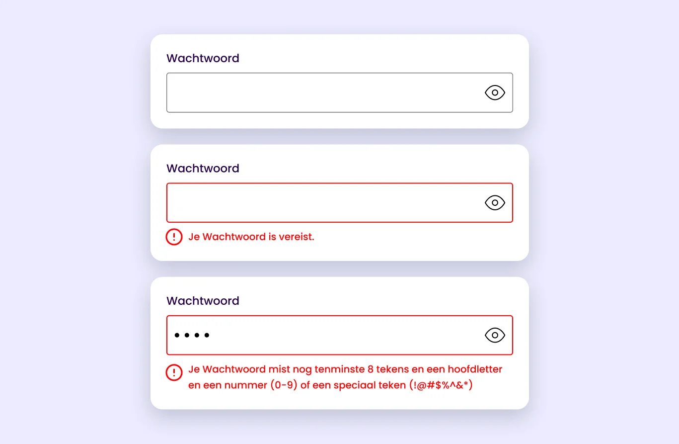
Tip 10: Use a mix of textual and visual confirmations
Show the user immediately whether what she has entered meets the requirements of the input field. For example, with a tick ✓ and a green border. You can indicate errors with, for example, a red ✗ or an exclamation mark and a red border around the input field.
Make it extra easy for the user by also directly indicating what went wrong and how she can fix it.
It can also be useful to offer automatic feedback so that users immediately know whether the information they have provided is correct or possible. For example, when choosing a username. This way, the user does not have to submit the form several times to check whether their desired username is available.
Example of Ikea error messages
When creating a new account at IKEA, the password requirements are not even on screen and are only shown when you start typing. This can lead to frustration because it looks to the user as if she has already done something wrong even before she has filled it in completely. It can also create doubts.
Make the form manageable
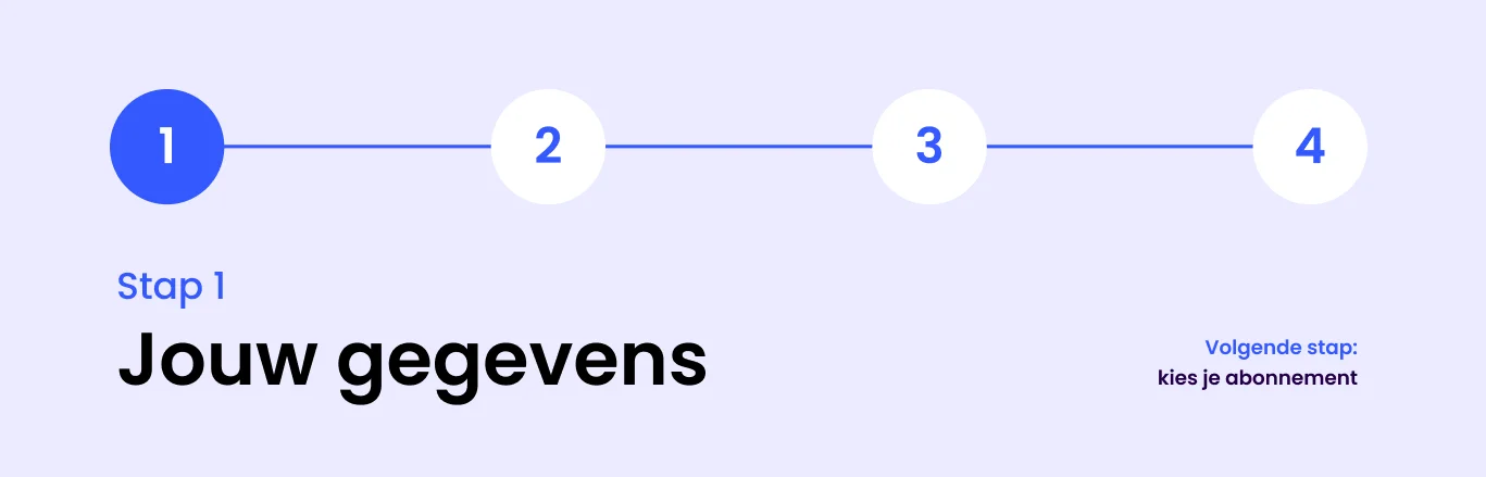
Tip 11: Divide the form into steps
When a form is long, it can help users to divide the form into shorter steps. This makes the form less overwhelming and easier to understand.
This mainly applies to people who have less experience with computers, for example. Or people with cognitive limitations.
How best to go about this?
The first step in the form should indicate how many steps the form consists of
Each step should also indicate how far along the form the user is
Change the title of the page to make the progress clear
Repeat the overarching instructions for each page/step
Make it easy to skip optional input fields
Tip 12: Don't use a time limit
Users should be able to fill in a form at their own pace. Therefore, do not use a time limit for your forms. If it is necessary for security reasons, it is important to give the user an option to turn it off or extend it.
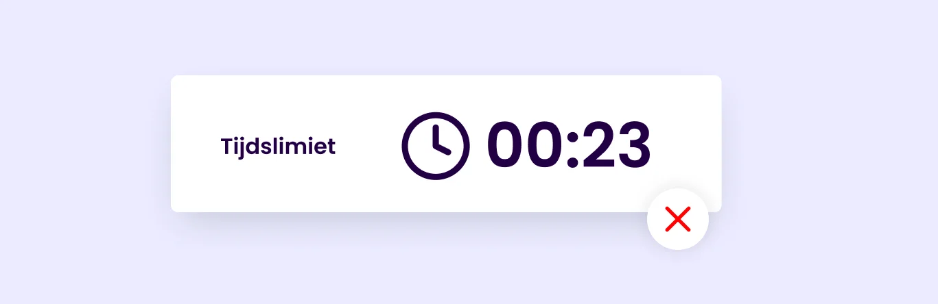
This does not apply to events, auctions or games where time plays an important role.
Be careful not to place a 'reset' button next to the submit button either. The chances of a user clicking wrong are very high. As Jessica Enders says, there is no better way to frustrate your users than for them to accidentally delete all their entered information.
“There’s no more surefire way to frustrate your users than setting them up to delete their own information!” Jessica Enders (2016)
Tip 13: Additional check before sending
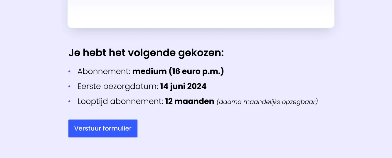
At the end of a complex form, it is smart to provide a brief summary of what the user has filled in. This way, she won't start doubting whether the form was filled in properly before sending.
Conclusion accessible forms
Accessibility is not just about design. It is an interplay of functionality, technology, design and text. A functionally beautiful design is just the beginning; the technology behind it should also be seamless with assistive technology. Fortunately, there are plenty of guidelines for that! In this article, you have learnt how to improve your forms and make them more accessible.
Don't know where to start? Apply these 13 practical tips to your form immediately:
Use a clear <label> element in the code
Increase the clickarea by using labels above input fields
Group related input fields
Give instructions inside the label OR
Place instructions directly below the label or input field
Use appropriate colour contrast for instructions inside input fields
Clearly indicate mandatory or optional fields
Use headings to show errors or successes
Use headings to display errors or successes
Place a summary of error messages above the form
Use a mix of textual and visual acknowledgements
Divide long forms into steps
Don't use a time limit
Provide extra control when sending complex forms
What will the future bring?
Accessible forms are not something you need to address only in the future. They are already necessary for an optimal user experience. Every time you fail to consider the diverse needs and capabilities of users, you miss an opportunity to increase your reach and impact.
Inclusivity in design means making products and services accessible to everyone, regardless of their physical or cognitive limitations. By investing in accessibility now, you are building a solid foundation for your online business.