A webshop down to the last detail
Concept7 & The Alpha Men
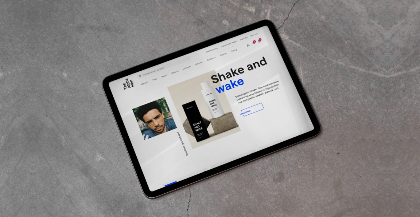
The Alpha Men is an online webshop: for all men who like to look groomed and healthy. With a new branding they knocked on our door: we are ready for a website that breathes The Alpha Men. Well, then you're in good shape with us....
- The customer The Alpha Men
- Cases
- Results thealphamen.nl/
How did we help The Alpha Men?
Over The Alpha Men
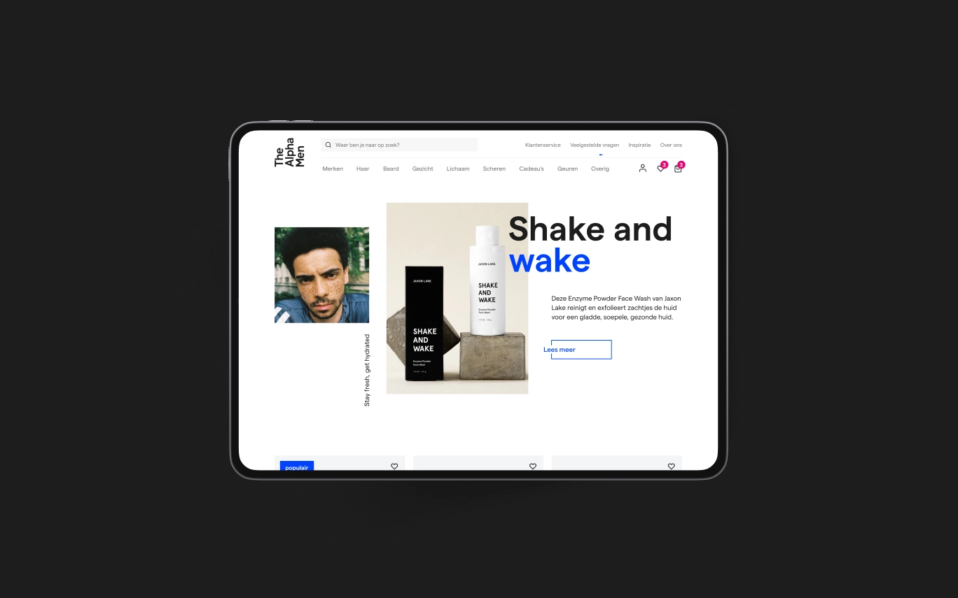
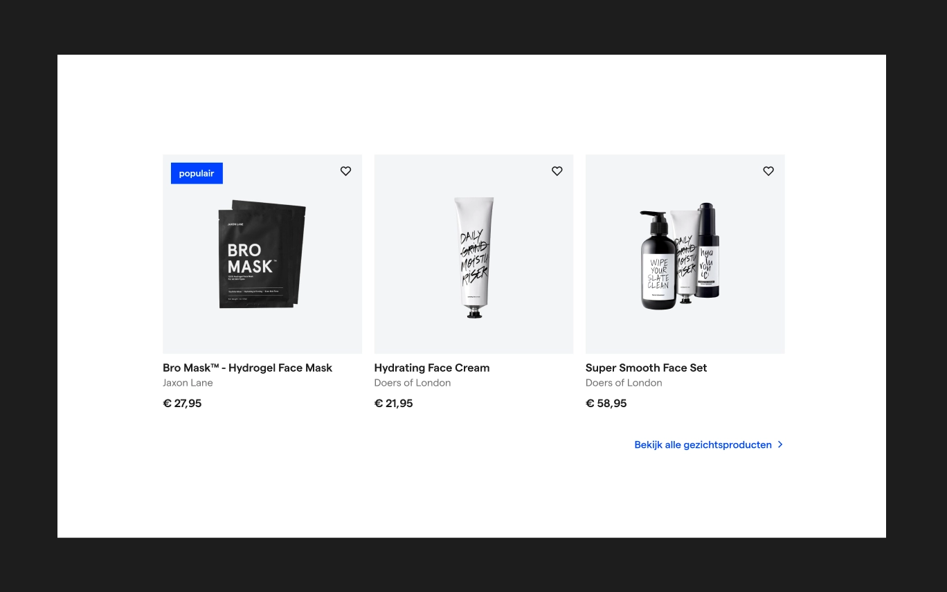
From shower gel, hand balm to sunscreen powder, The Alpha Men has everything to make men shine. Inside and out. This online shop goes beyond the order button. The team behind the scenes is happy to help you. Because: do you actually know your skin and hair type and which products match them?
The Alpha Men is therefore happy to advise you. Besides products, their platform is all about stories and tips for men. Now all we need is a slick website that embraces their passion for the best grooming products....
What is the challenge?
The Alpha Men wants to play a guiding role on a user-friendly website. But right now, customers experience choice stress and struggle to get to the right product. Also, due to the design, there is little space to offer sufficient advice and choice assistance in an orderly manner.
With an appropriate and clear website, besides realising a fine user experience, we also want to increase the conversion rate.
Inzicht in gebruikers en organisatie
Before we design, we always start with the research phase, in which we learn as much as possible about the service, the market, the character of the organisation and of course: the different target groups and their needs.
Human-centred design: the user is central
Human-centred design is in everything we do. This is an end-user-centred design process. This working method can be found in almost all our project steps. We ask organisations all the ins and outs about your target group. Because only when you really know your target group will you know what you can improve.
In conversation with The Alpha Men
The team at The Alpha Men took ample time to go through all our questions. These questions were based on the organisation itself, but also on the target audience. "How would you describe your services?" to: "Are your customers brand loyal or do they explore?"
In this series of questions, we get a clear picture of the brand image and can create personas that match their current customers.
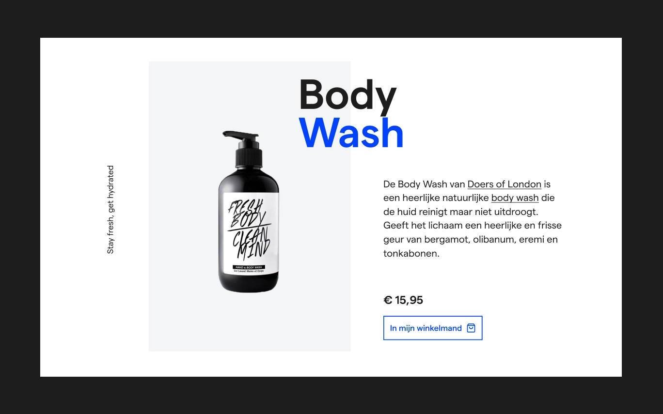
Het concept: All for all
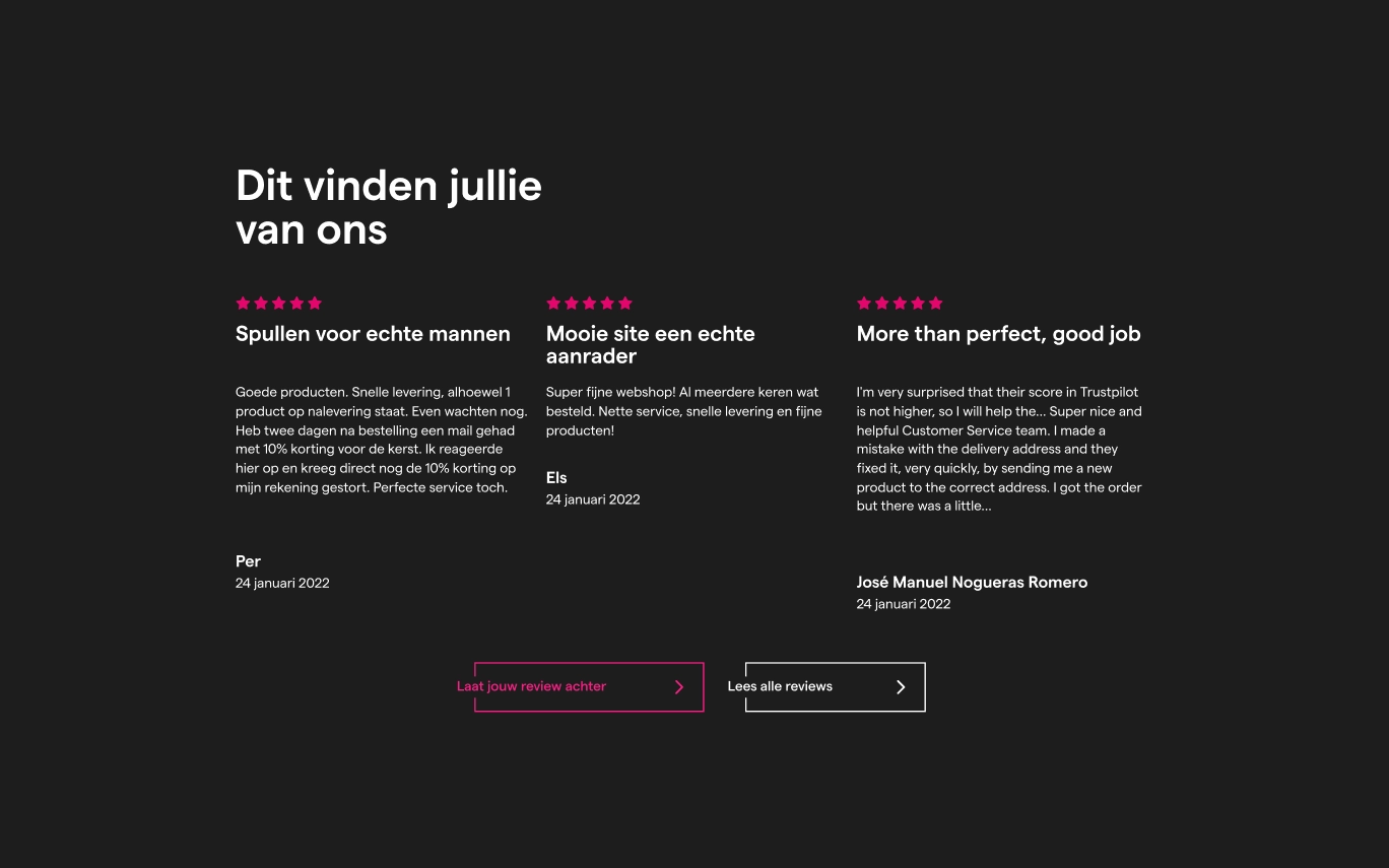
"Being a man" changes drastically over the years. A shift is taking place. Whereas before we could all still form an image of "the stereotypical man", this now seems to be fading away.
The Alpha Men is therefore aimed at everyone and is an all-rounder. Because: you are allowed to be different from others. From the perfectionist to the fuss-free man. We go for an inclusive website. Because we are for everyone, we are different from the rest.
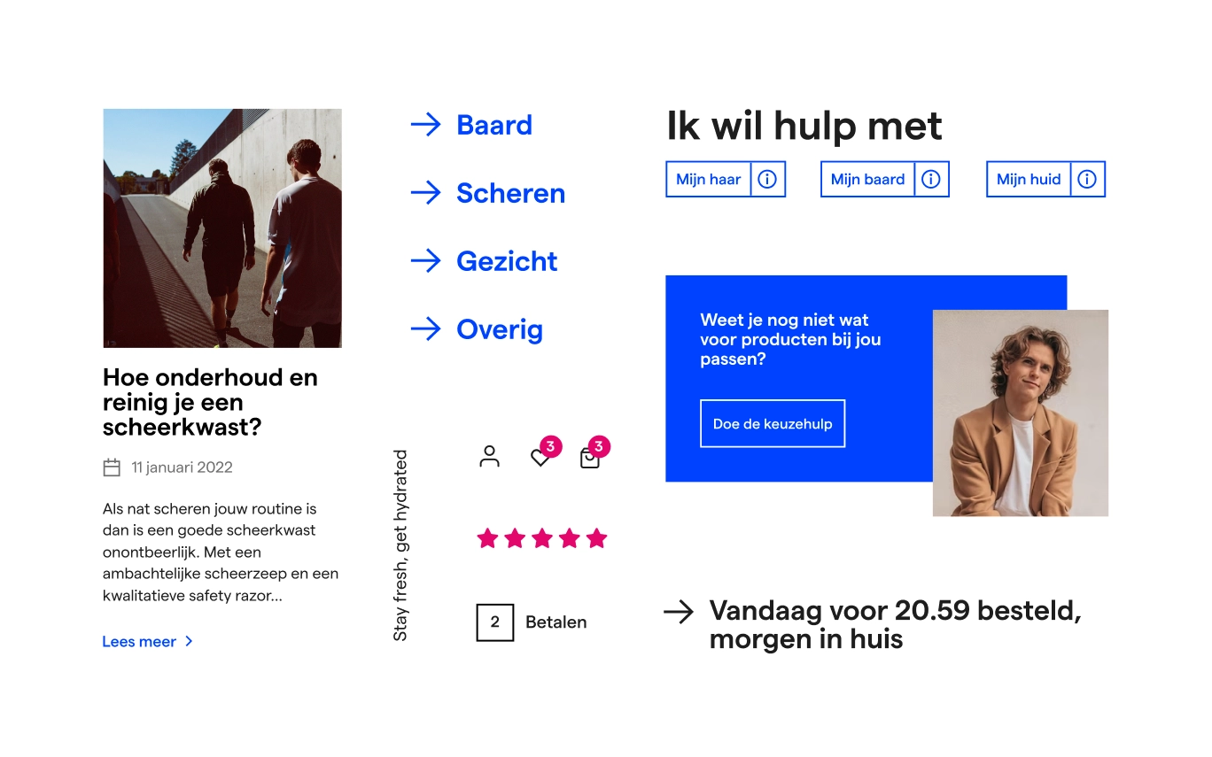
Een piekfijne UX- en visual design
The corporate identity was previously designed by advertising agency RTRN in Groningen. Our challenge was to mould it into a beautiful and user-friendly website.
Our design team focused mainly on these 3 principles:
The concept must be clear
Serving new and existing customers well in their information needs
As fully as possible in line with the wishes of the MBTI target groups
Appearance of brand feeling
The Alpha Men is high-end, modern, but also definitely accessible. The design has chosen a combination of black and white and minimalism, in conjunction with product images with plenty of focus and tranquillity.
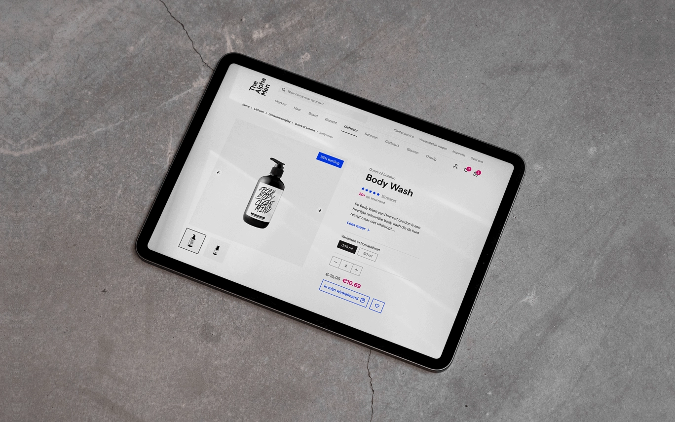
Every man's friend
The Alpha Men thinks with you. You experience advice and tips at all sorts of points throughout the website. On the specific product page, we have focused on clear descriptions and features. We also broach a wide variety of topics in the blog so that every man feels heard. And this is how we turn just a webshop into a vibrant community.
Also score with us?
Want to know how we can help you be more digitally successful?
View more success stories
View all cases
Start your digital success today
Pim Klomp is happy to help you on your way.
Mail to hallo@concept7.nl
Or call 050 36 00 233

