Scoring with the ideal online brand experience
Concept7 & Donar
The warm-up starts with flashing fireworks, you can almost feel your favourite players through the gigantic banners and the stadium is buzzing with all the blue-and-white-coloured fans during a beautiful volley...
Donar has a tantalising live-experience and a unique community-feeling. The top Groningen basketball club would like to extend this ultimate brand experience digitally. A great challenge for us!
- The customer Donar
- Cases
- Results www.donar.nl
How did we help Donar?
Pain-points check by cro-scan
Insight through group session and focus group
Translating to ux and visual design
Building the website
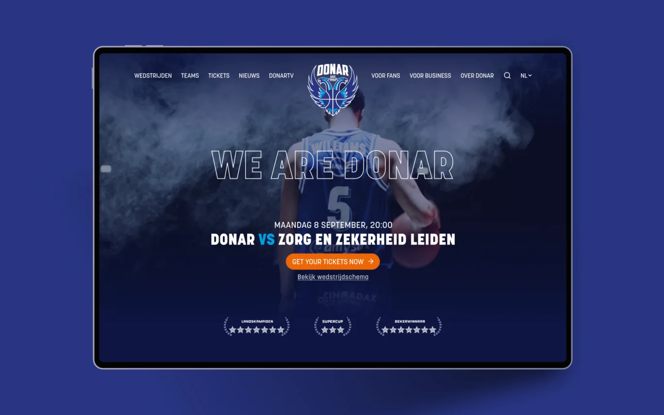
'We are Donar'
We know Donar as the Groningen basketball club and one of the Netherlands' best-scoring teams. With MartiniPlaza's top sports hall as their home ground, they make the sporting day out possible for some 4350 spectators.
You ask, we build
Human-centred design is in everything we do. This is a design process in which the end user is the focus rather than the organisation. So it's a win-win for both!
Pijnpuntencheck met de cro-scan
How well are Donar fans being helped on the website? Through a comprehensive analysis, our cro-scan, we immediately saw the main areas for improvement:
website loading time;
findability in search engines;
efficiency of the techniques used;
information provision and structure;
fan experience.
Inzicht door groepsessie en focusgroep
You get the most valuable insights by listening to your target audience. The group session with Donar and a focus group with fans and business card holders made it clear where we can pick up points with the website, such as:
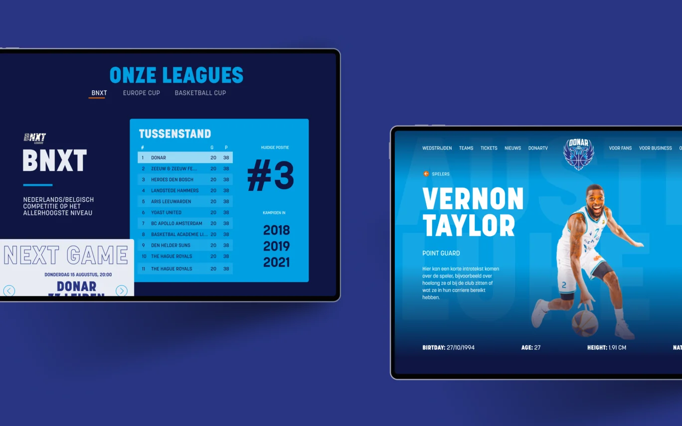
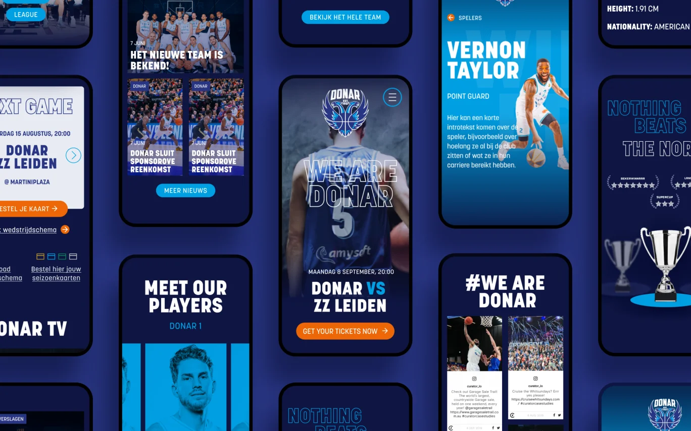
clear placement of the playing schedule;
more information on the players;
easier navigation to the fan shop.
De doorvertaling naar design
The insights stand and the ball is in ux design's court. What should be immediately visible? What is edge information? And what will the overall layout look like? Through the information from the human-centred design process, the first sketches were made.
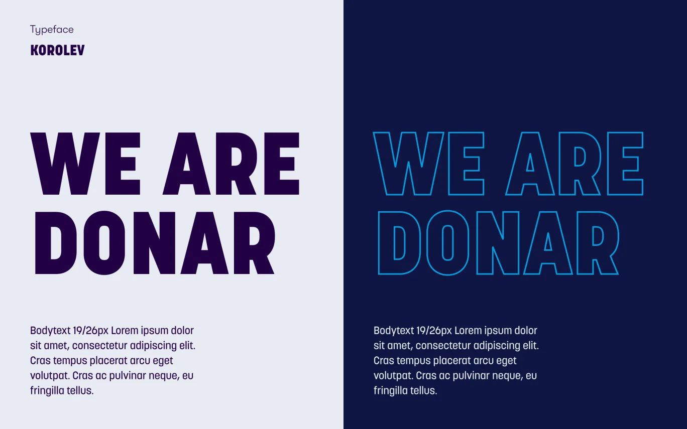
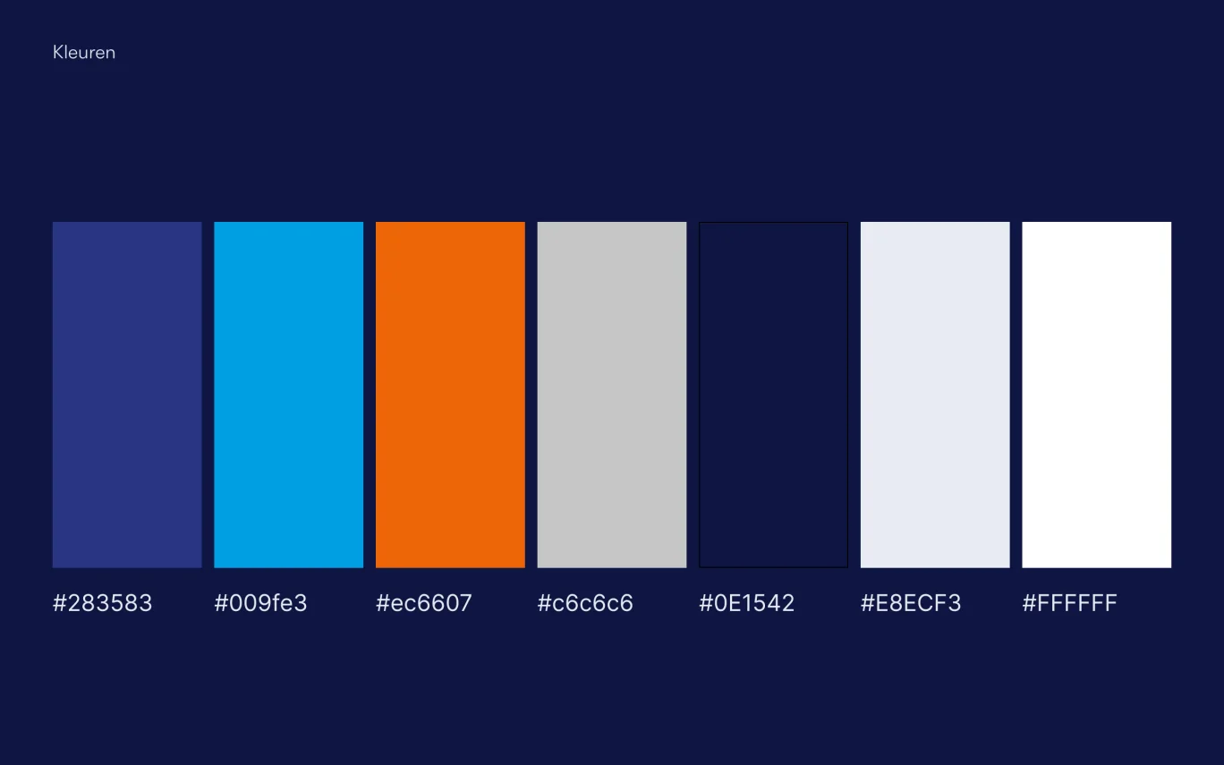
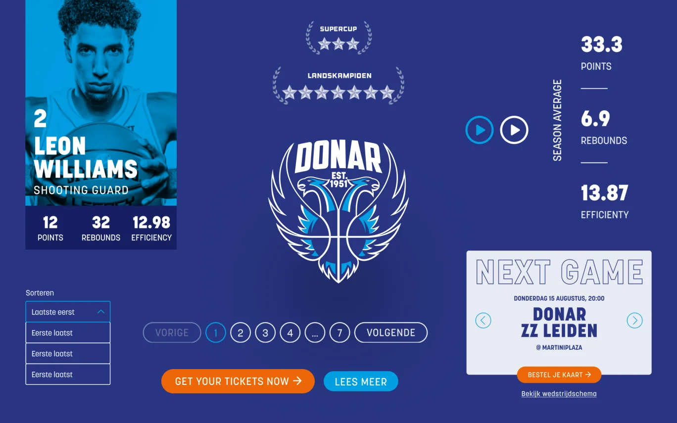
A new website full of iconic features
How does the website breathe Donar? Our visual design team has the answer. By using design typical of the basketball world, complemented by powerful motion graphics. And all this mixed with the high-profile brand identity of the Groningen club.
Big, bold typography, as you know it from the tenues.
Layered visuals with many dynamic elements of a match.
The players are portrayed as heroes. From the mysterious headershoot on the homepage to a dedicated page for each team member.
Beautiful websites are almost unique in the Dutch basketball world. With the updated digital concept, graphics and visual effects, Donar is ready for the future!

Jaap
Lead visual design at Concept7
Een website die werkt!
The design calls for a customised website. With building blocks that are easily editable, our developers also made the technology more user-friendly. Think video handling, keeping the BNXT (Dutch Basketball League) scores up-to-date and importing games from the basketball API.
What's next?
Together with Donar, we are going to take the online fan experience to an even higher level in the coming years. The website is just the beginning! Keep an eye on this case page for Donar's next online improvements.