Een website met een waterdichte funnel: van bezoekers naar converteerders
Concept7 & AquaCell
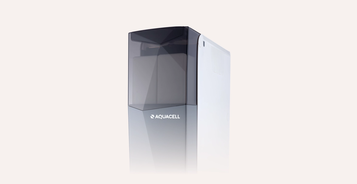
AquaCell is the Dutch number 1 in the field of water softeners. A market leader with a clear brand story needs a website that showcases the brand and offers the target group confidence.
- The customer Aquacell
- Cases
- Results www.aquacell-waterontharder.nl
The power of soft
100% soft, lime-free water for everyone in the Netherlands. That is AquaCell's mission. By constantly thinking along with (potential) customers and by being open and clear when it comes to service, information and advice.
The challenge
AquaCell has a clear ambition with its website: to target the highest possible conversion rate and with content tailored to their personas.
What were the guidelines?
A solid website as a foundation
Identify personalities and (learn) to serve them optimally
Technical realisation of the website and CRO further development.
Verschillende vormen van gebruikersonderzoek
Human-centred design is in everything we do. This is an end-user-centred design process. The method is woven into all project steps: from the first conversation with the target group to (and even beyond) the website launch.
With an extensive user survey, the potential and current target audience (and voting behaviour) was accurately mapped.
User session
The main conclusions are that the target group is expanding: from over-55s to increasingly over-25s. People with a new-build project or because of a move. The older target group is more on the "trust" and the younger target group finds sustainability more important.
Customer Journey
Using the insights from the (potential) target audience, we mapped the drivers from the customer journey.
Some of the triggers
In the orientation phase: high Google reviews
In the purchase phase: the possibility of paying off or renting
In the installation phase: the possibility of doing it yourself.
In the user phase: dropping by for service check after warranty extension
De doorvertaling naar design
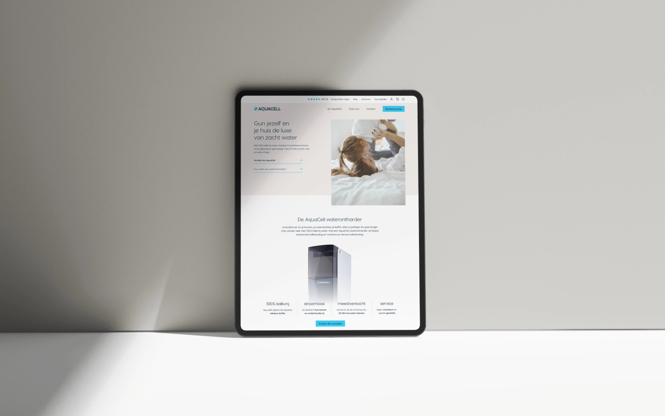
From the valuable insights, our UX- and visual design team set to work.
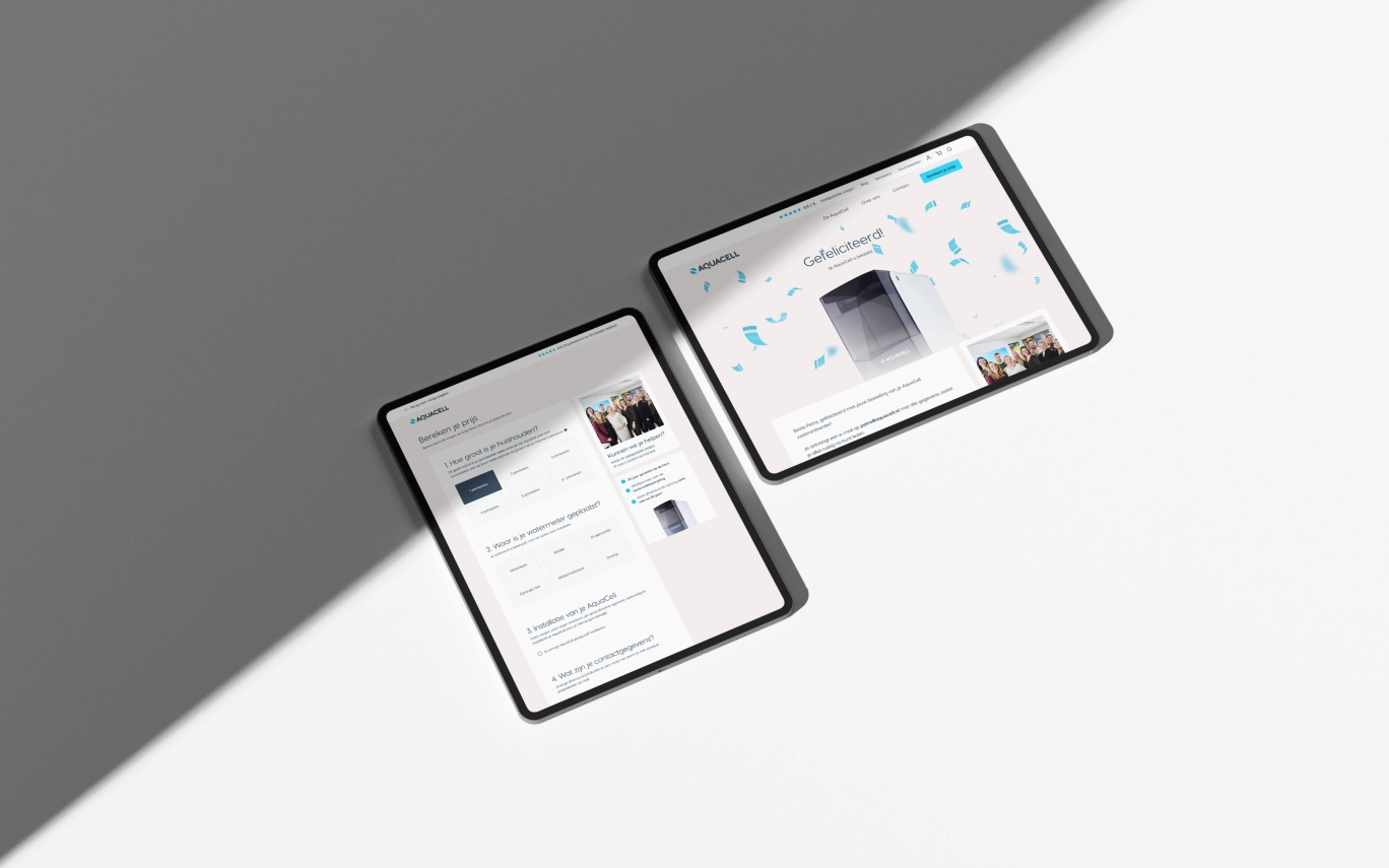
A new funnel has been completely thought out
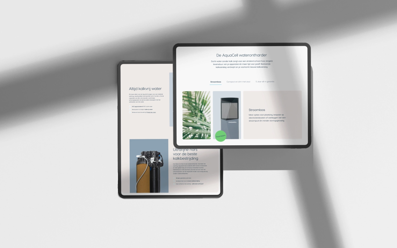
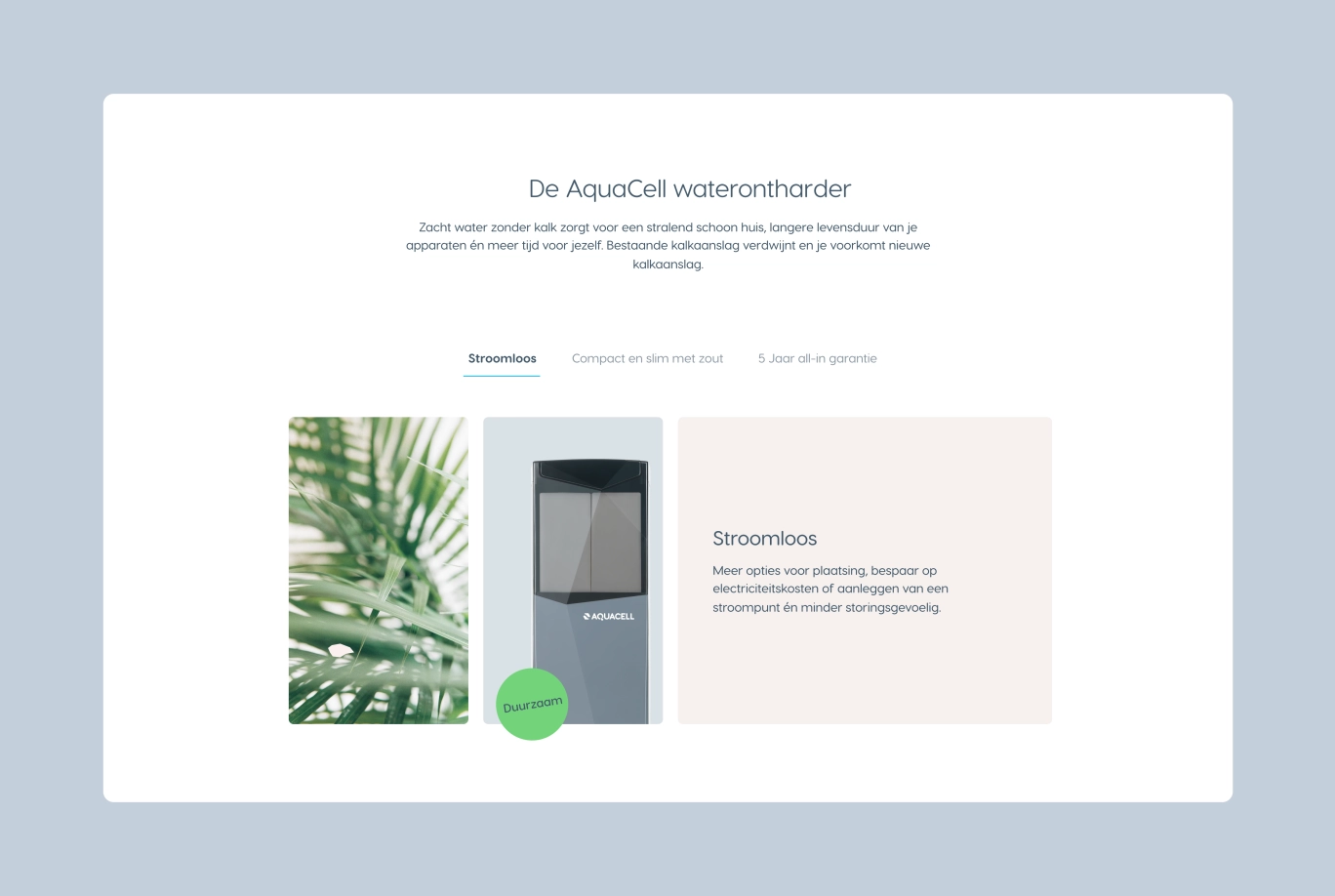
The design of the website is based on the soft nature of AquaCell
A high-end look that puts the product at the centre
.
A website that works!
And the result is impressive! We are proud, the customer is happy and so is the user, because
quotes requested increased by 27.5% on average (conversions)
the conversion rate increased by 56%
.
What's next?
AquaCell is still very ambitious, and we like that! The first version of the website is up and plans have been made for further optimisation. Soon we will tell you more about the CRO further development!
Score with us too?
Want to know how we make your business more digitally successful?
